Modo UI helps busy designers and small teams build polished, professional designs in minutes. No complex setup. No wasted time. Just a lightweight, adaptable toolkit you can rely on.
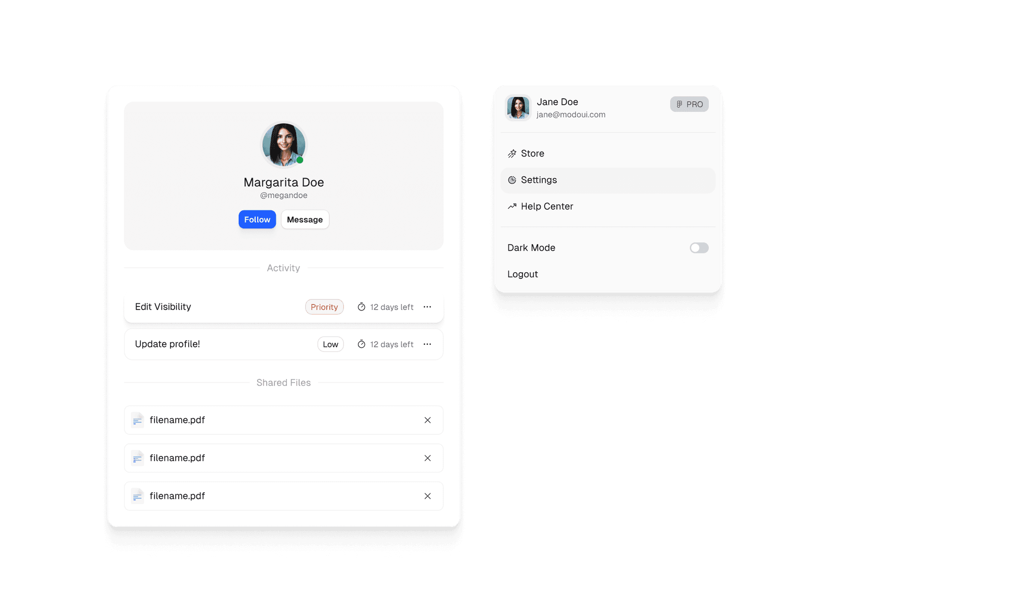
Interactive Components by Default
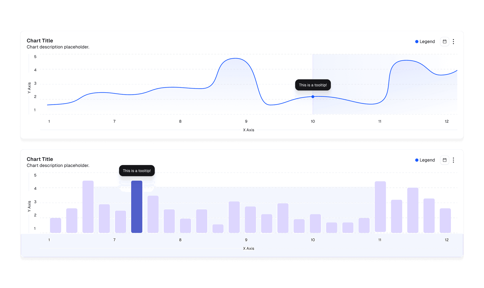
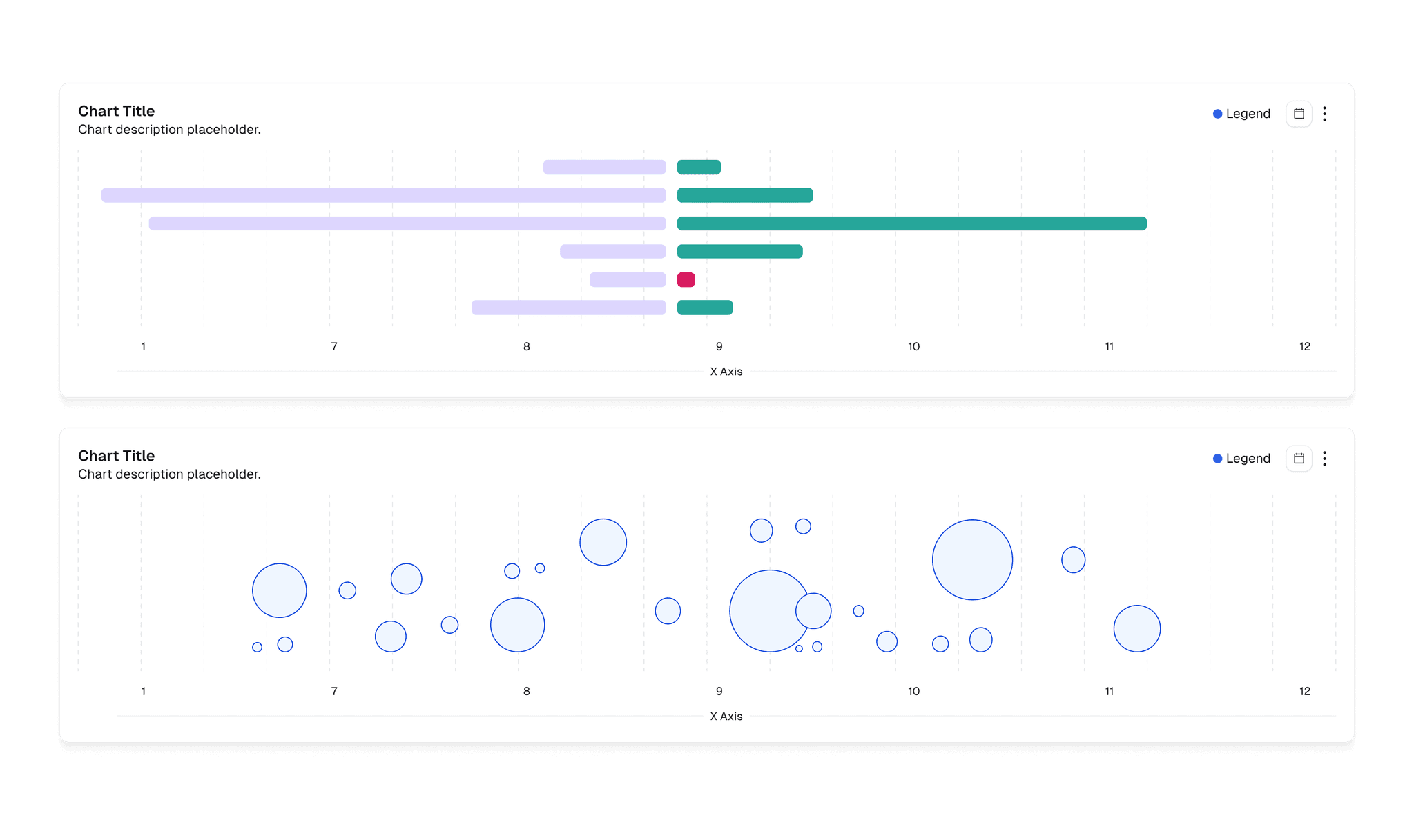
Bring your designs to life with pre-animated elements, enhancing user engagement effortlessly.
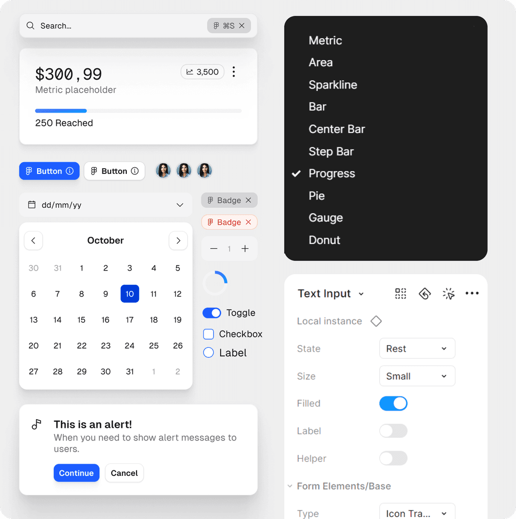
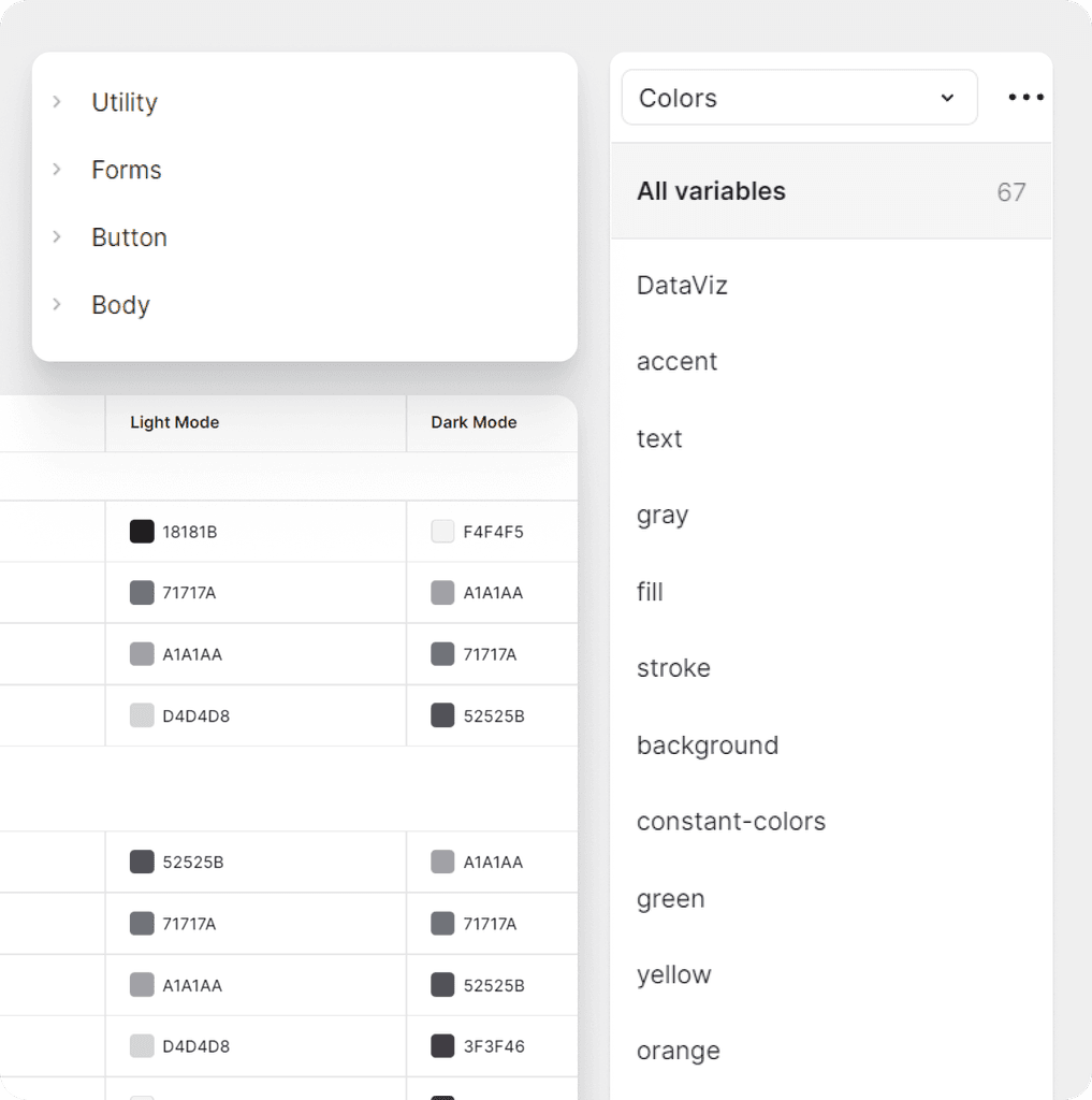
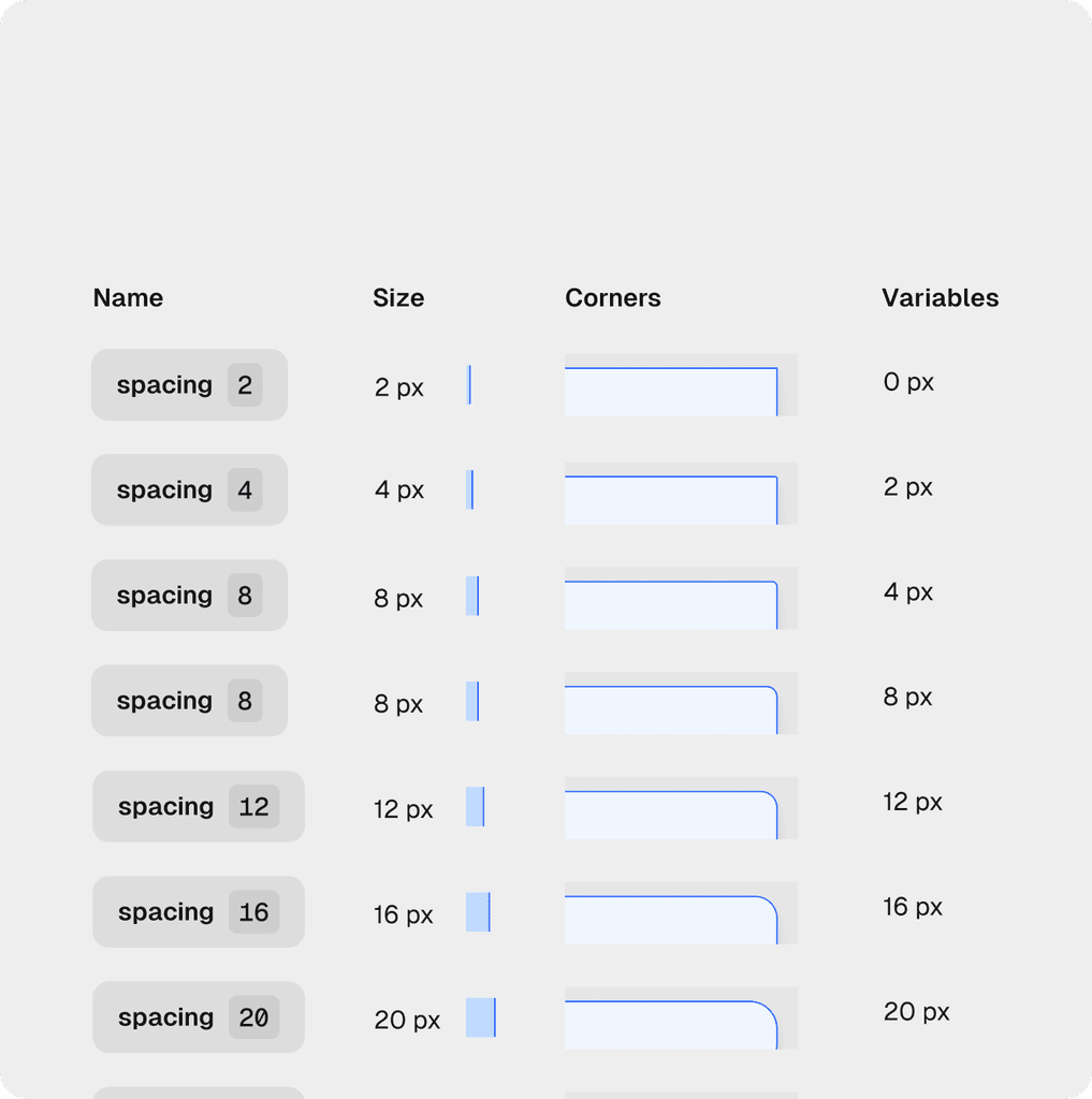
Easy-to-Maintain Variables
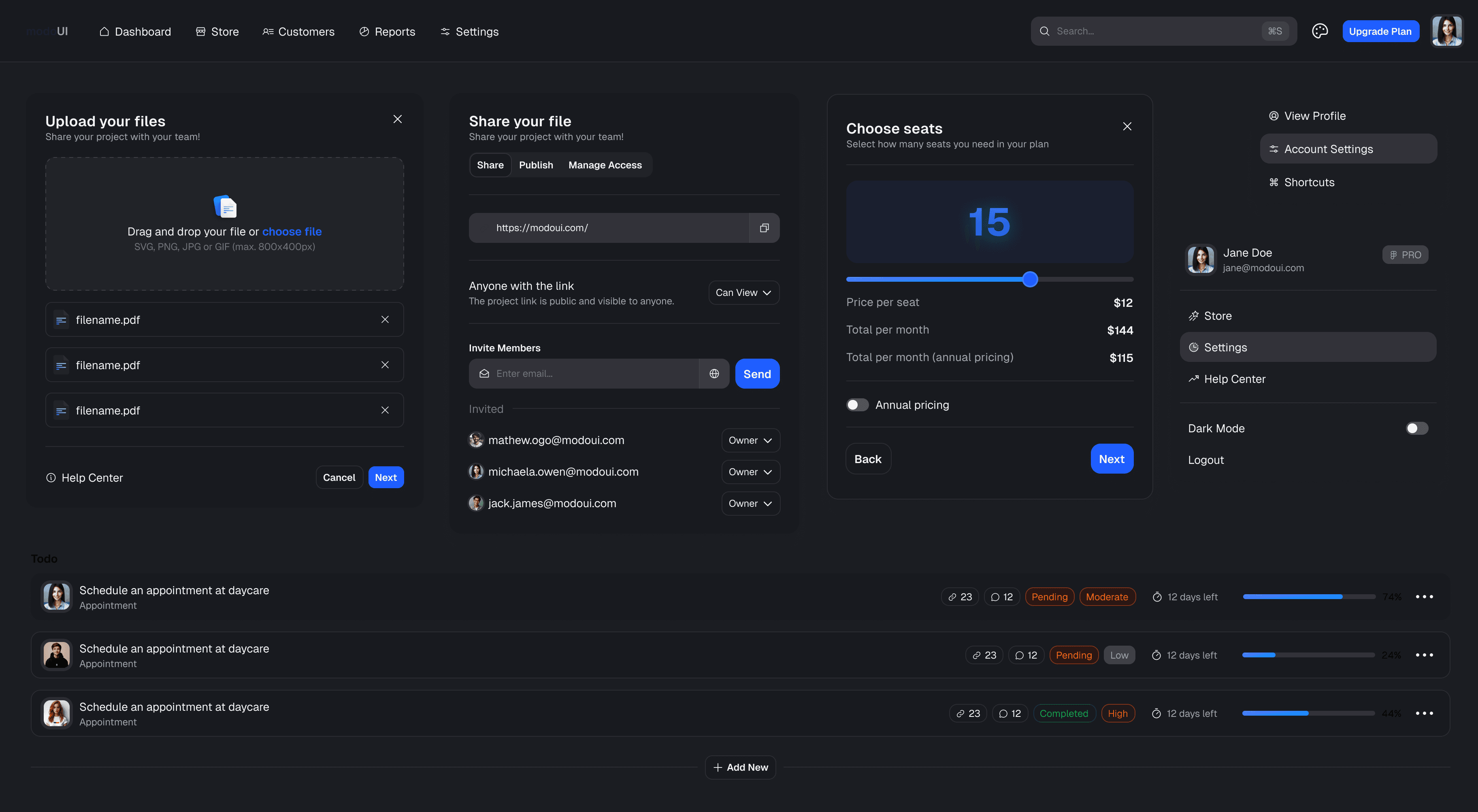
Easily control colors, typography, and styles with centralized variables. Switch between light and dark modes in seconds.
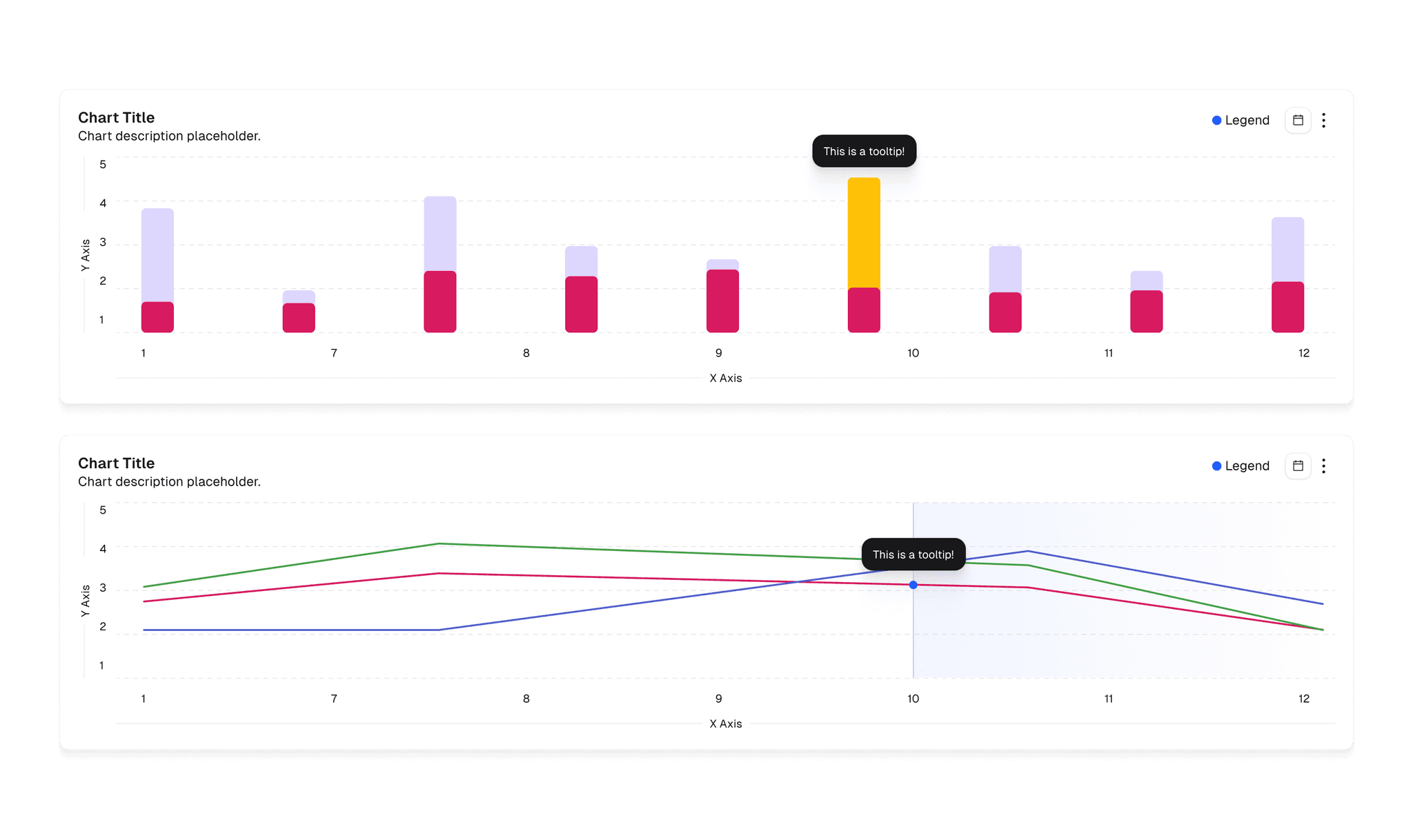
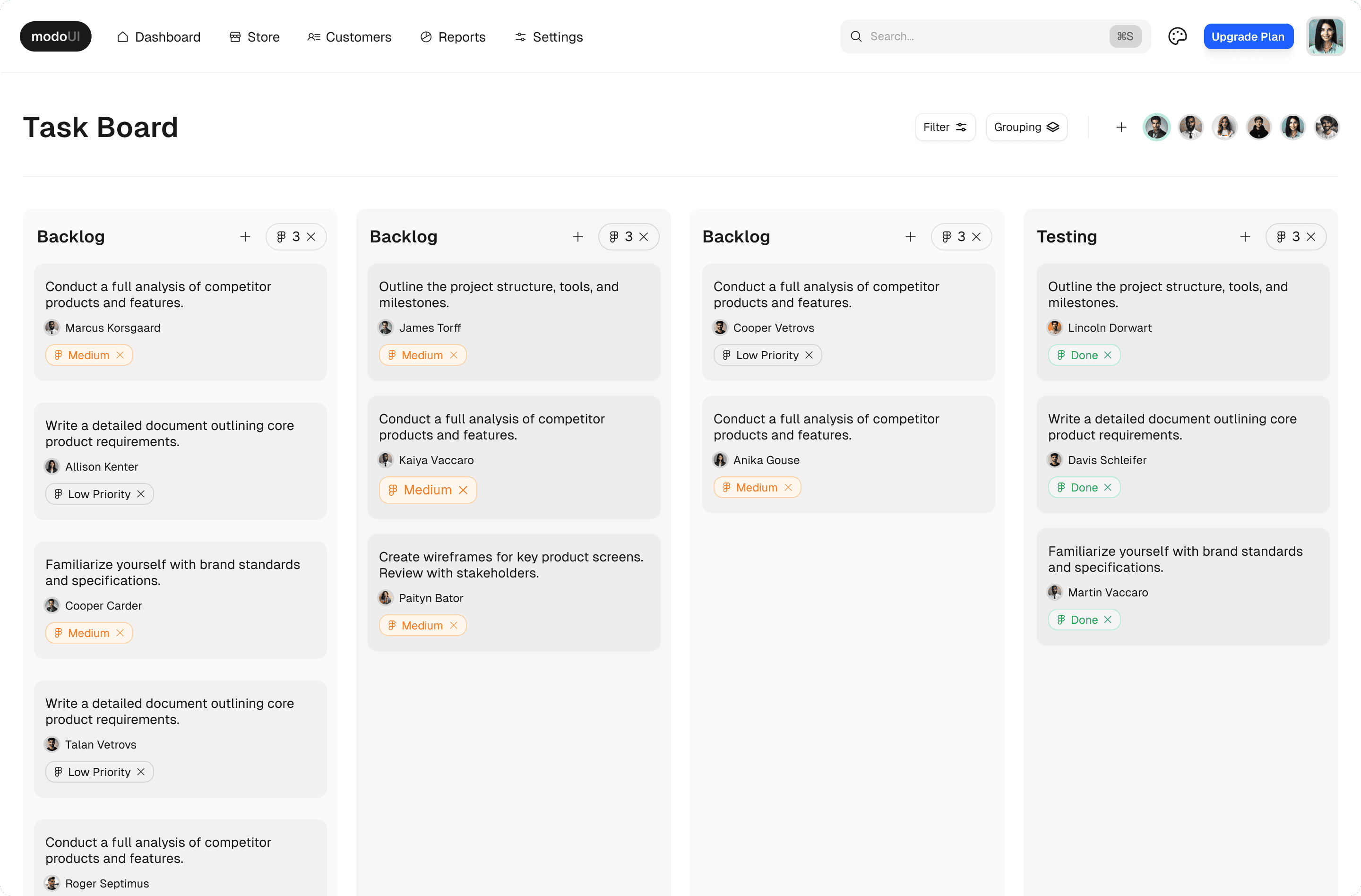
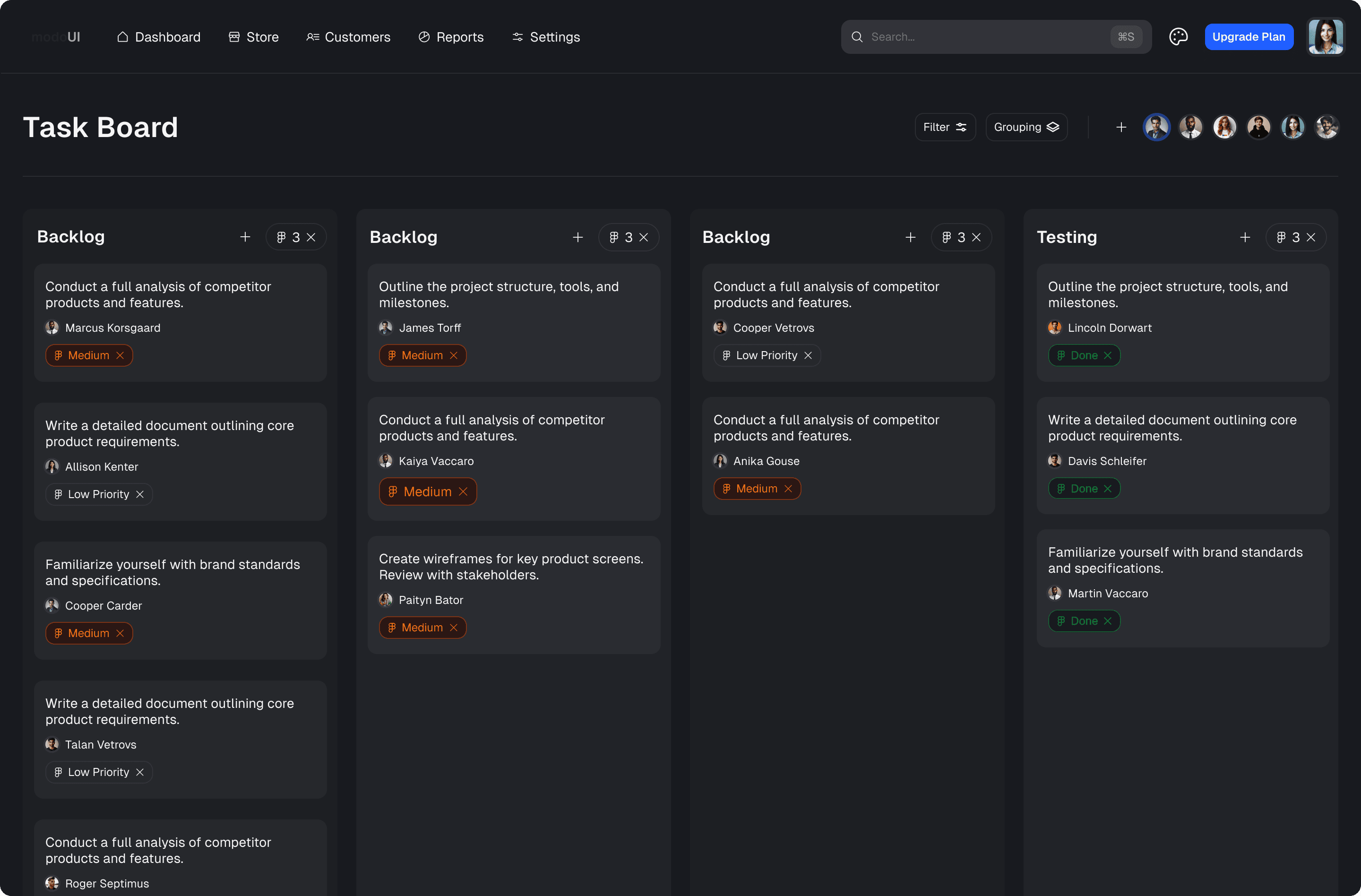
Responsive Grids & Auto Layout
Enjoy seamless integration with Figma's Auto Layout, ensuring responsive designs across devices
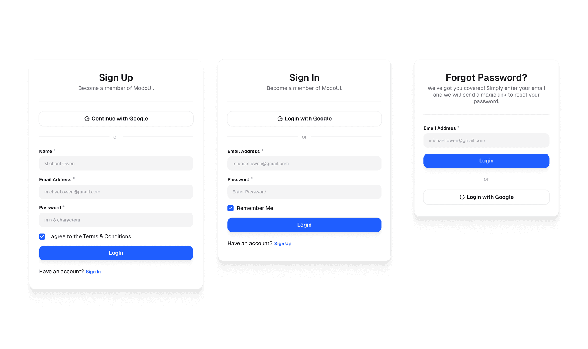
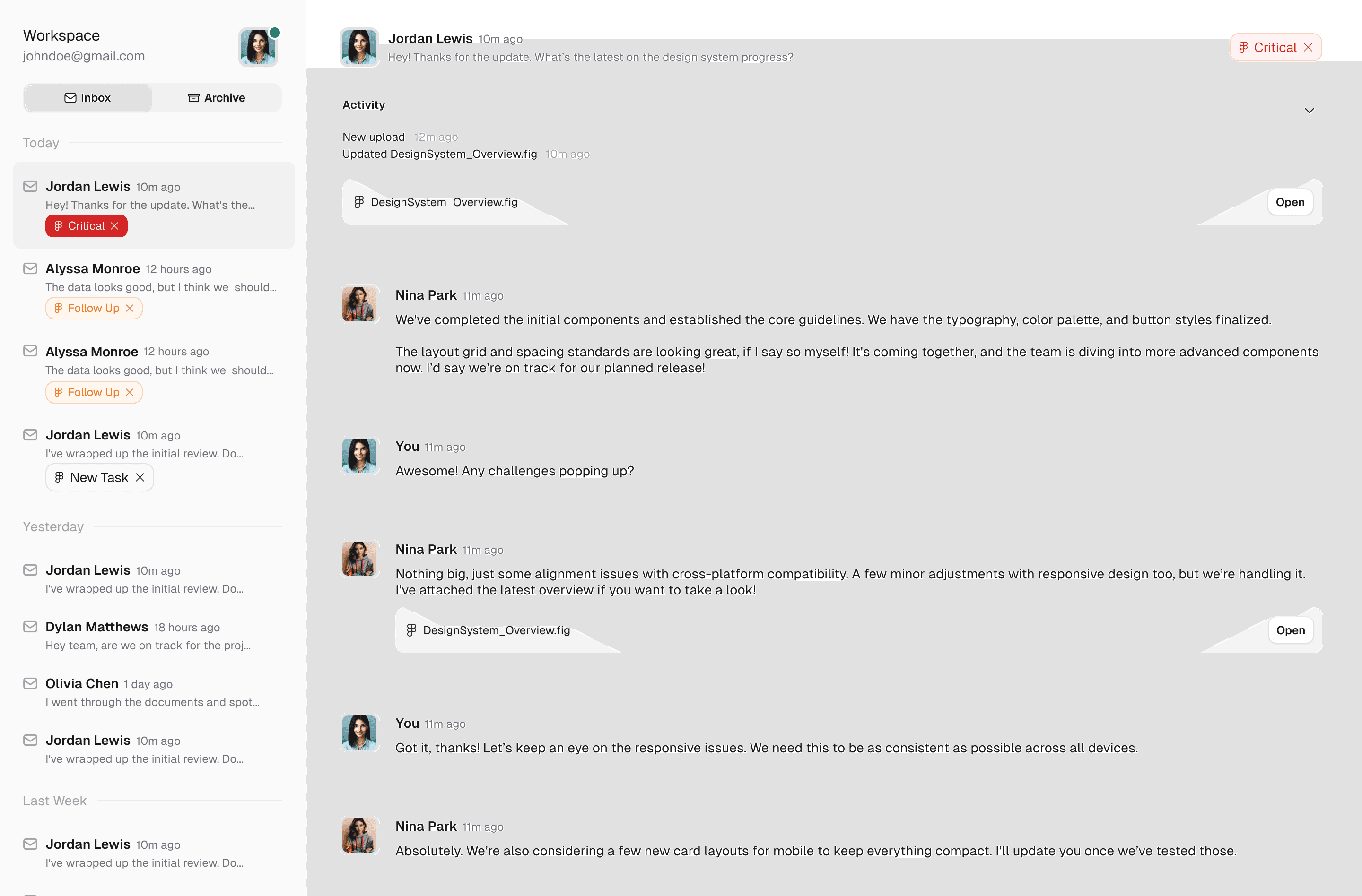
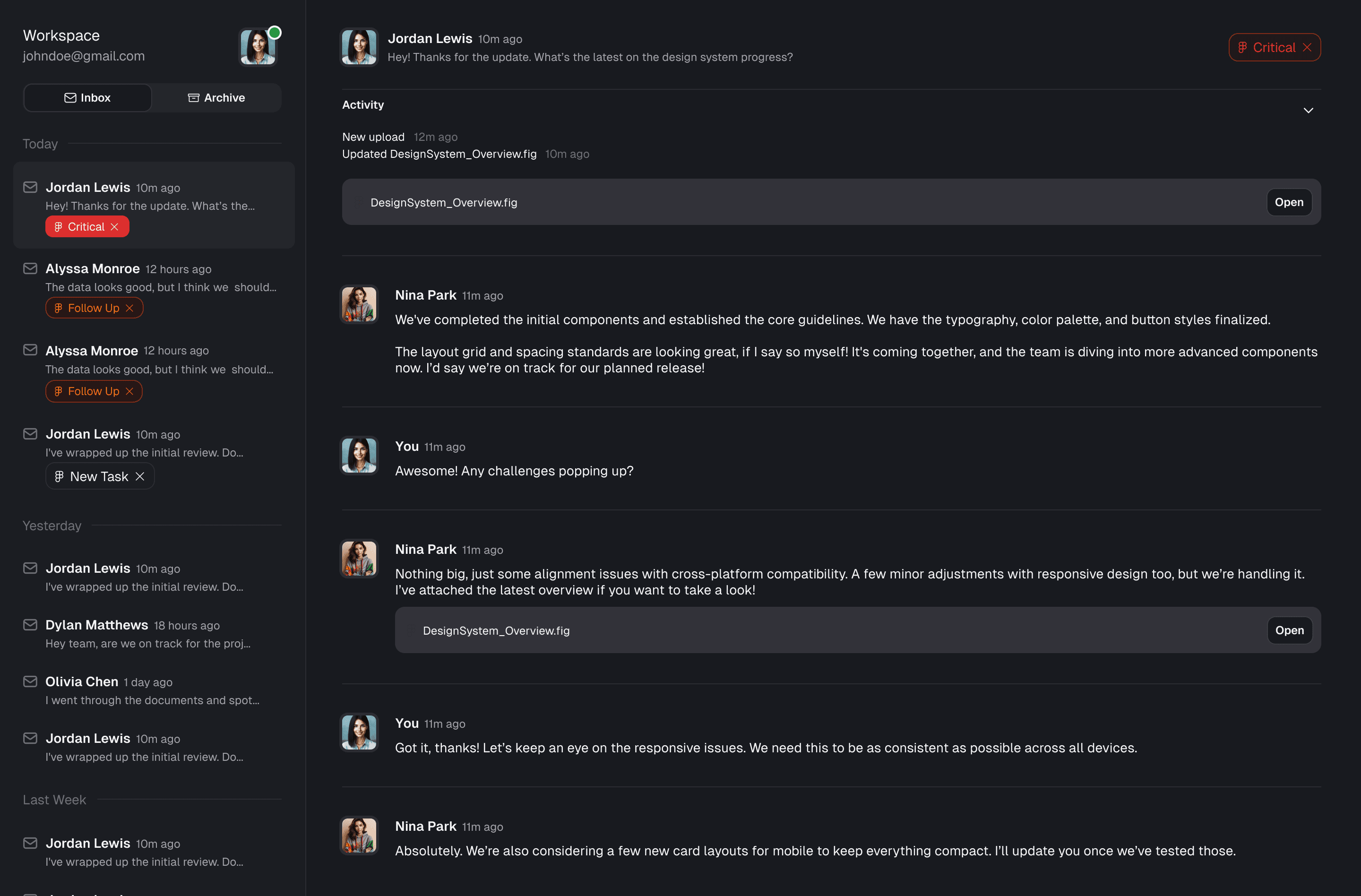
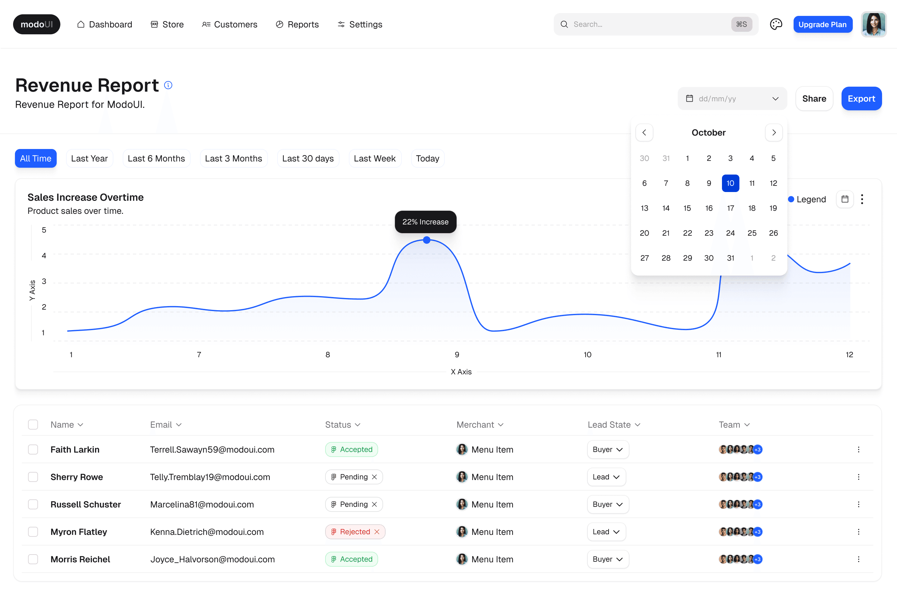
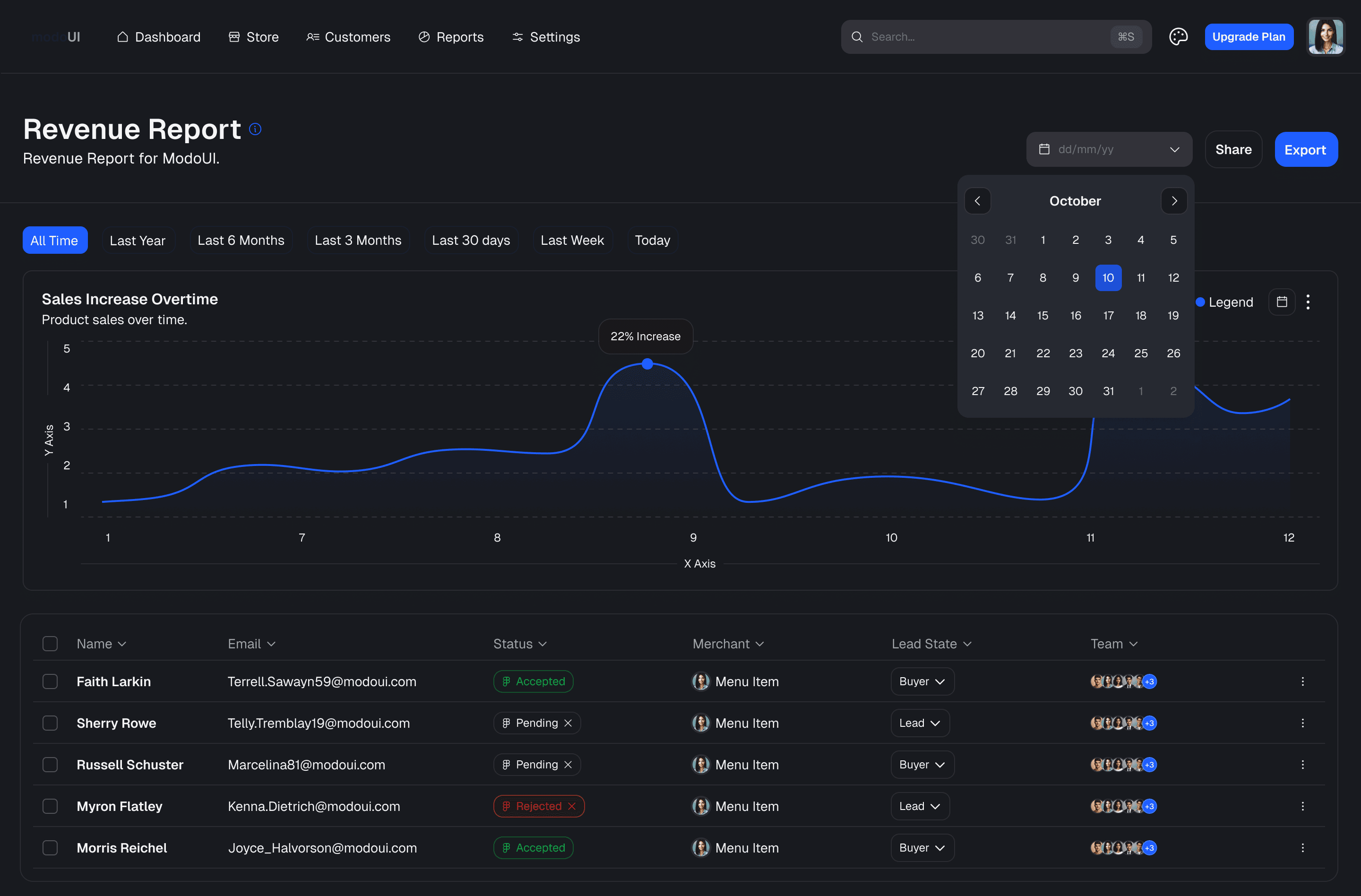
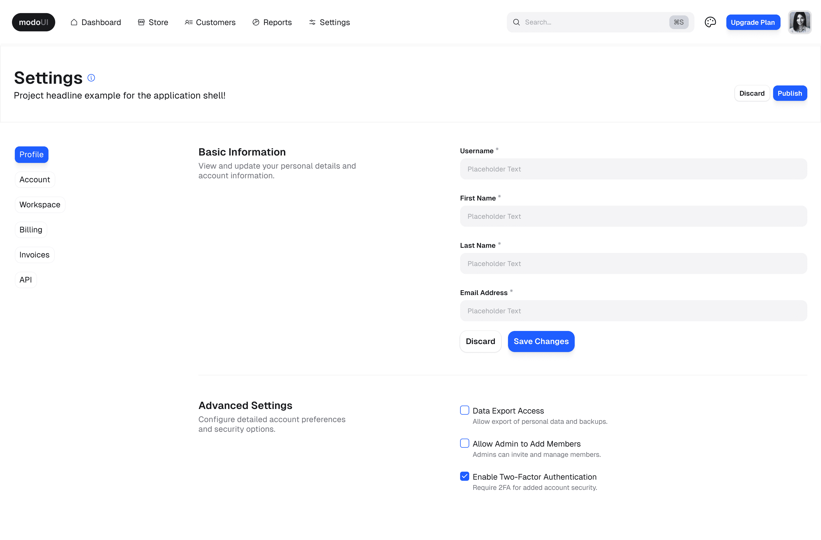
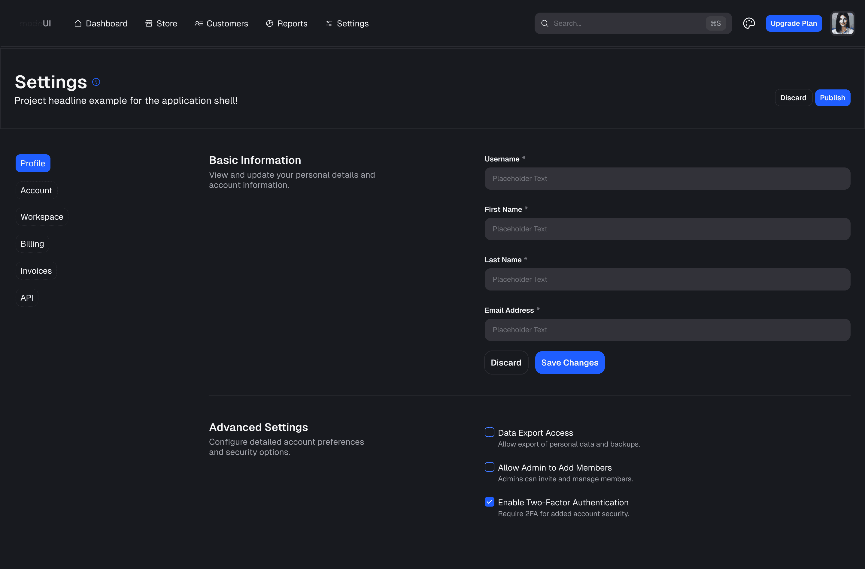
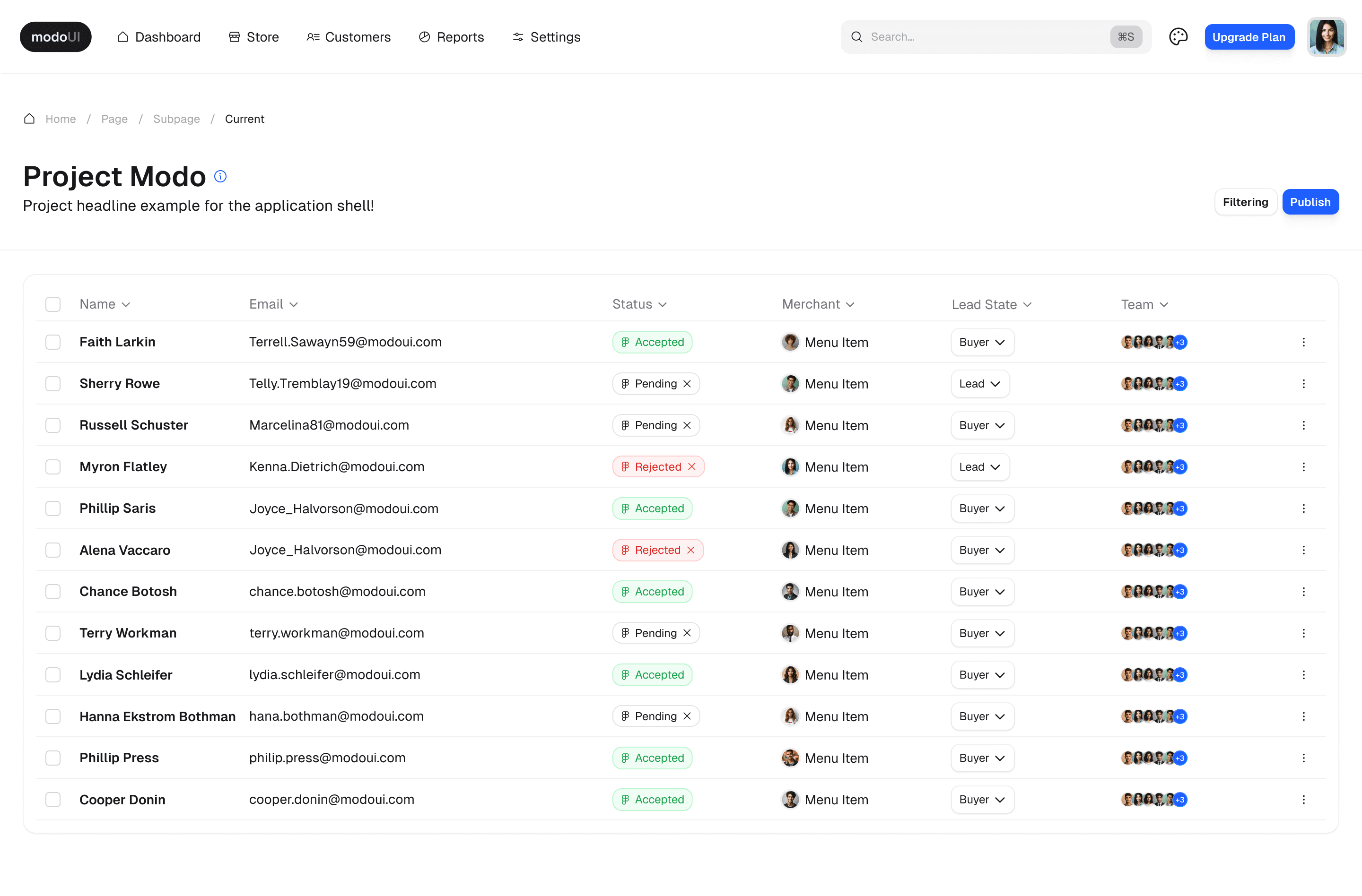
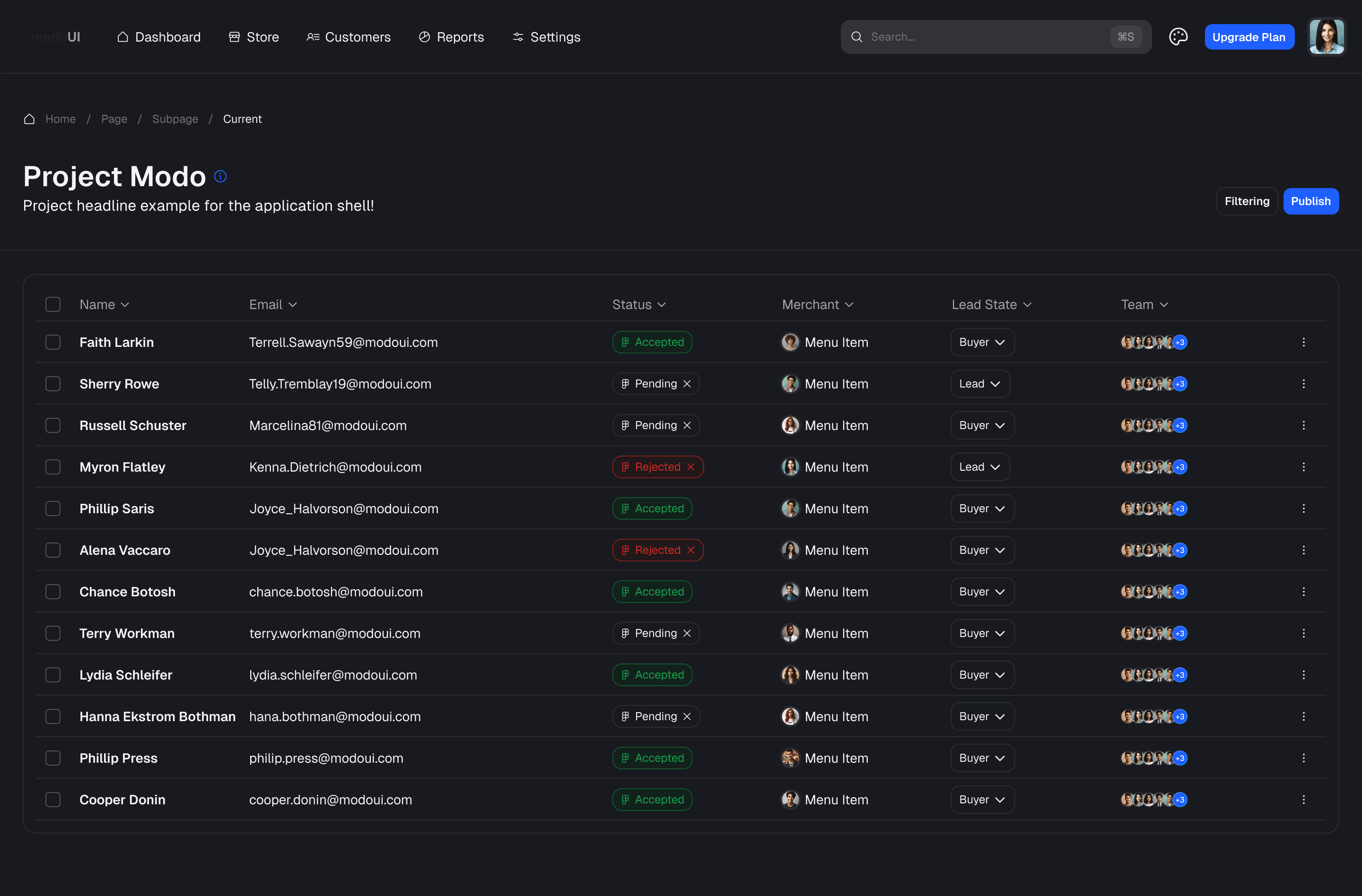
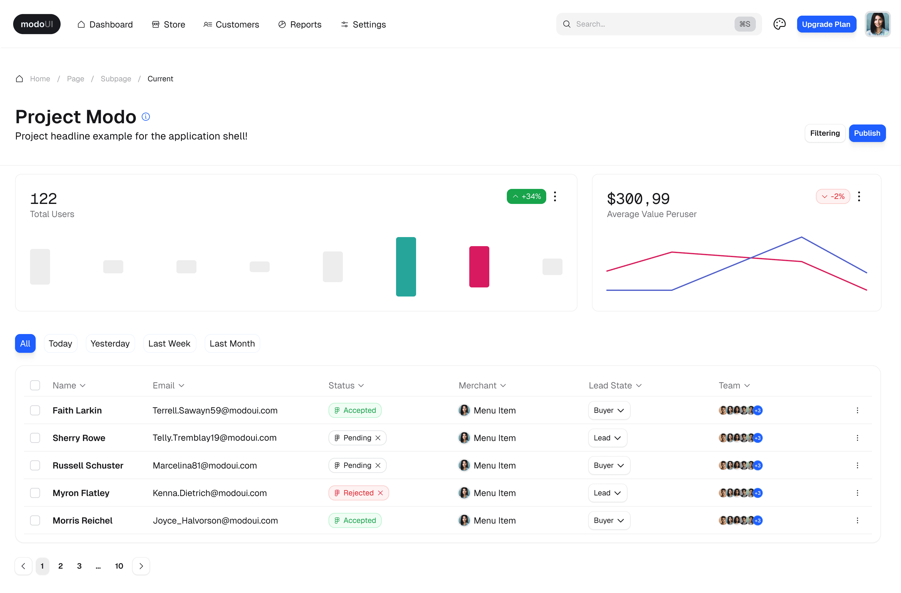
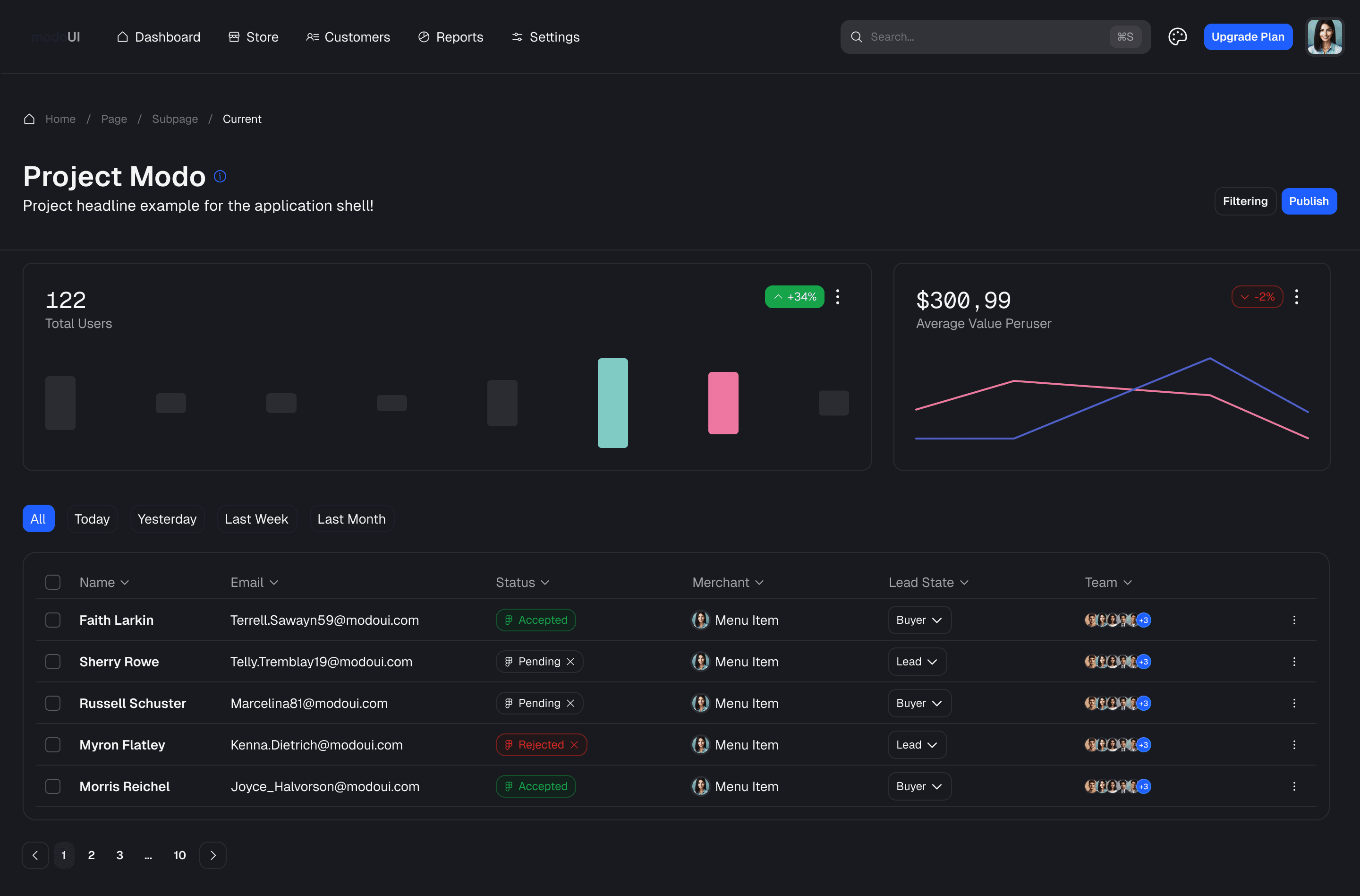
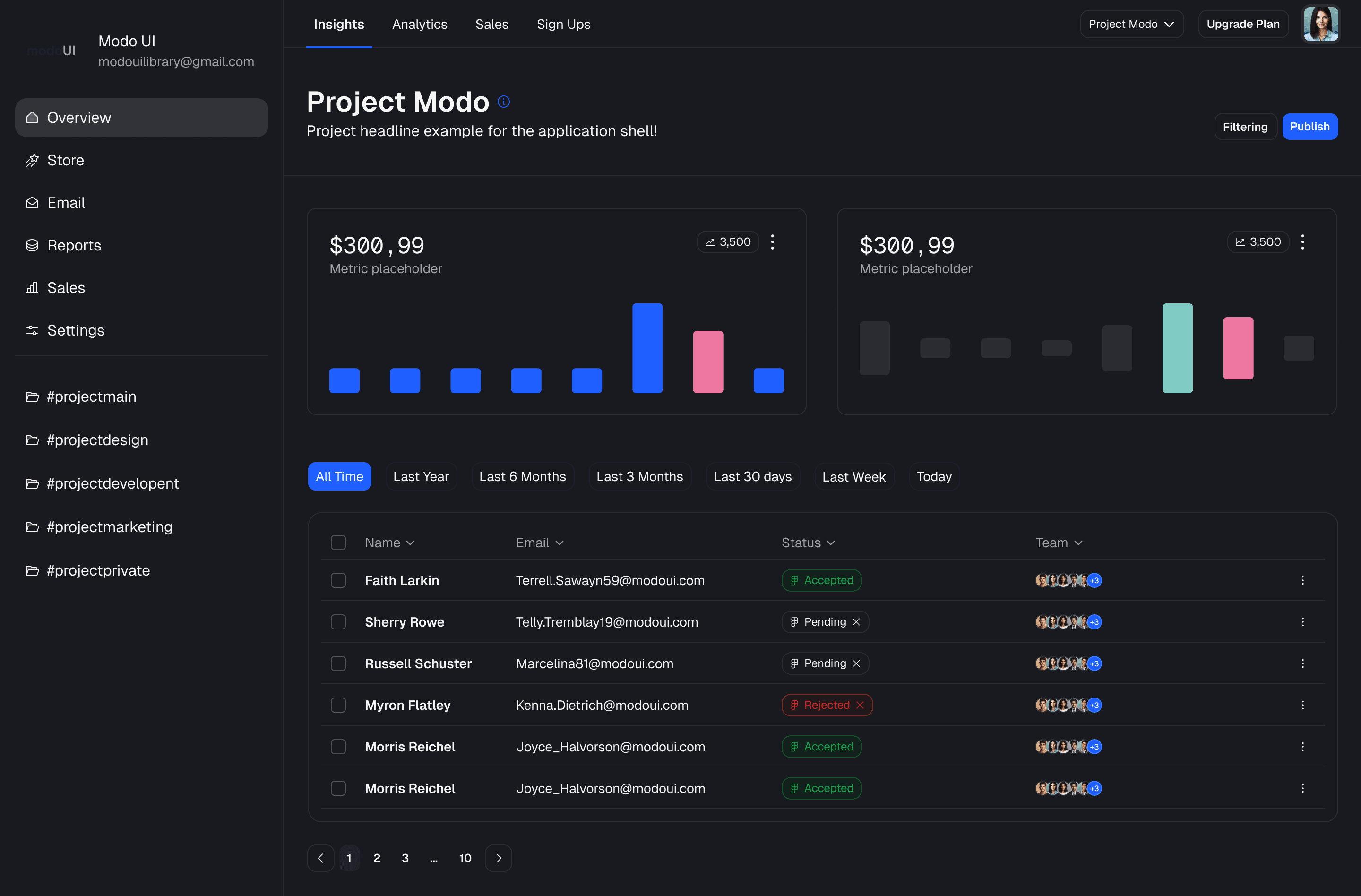
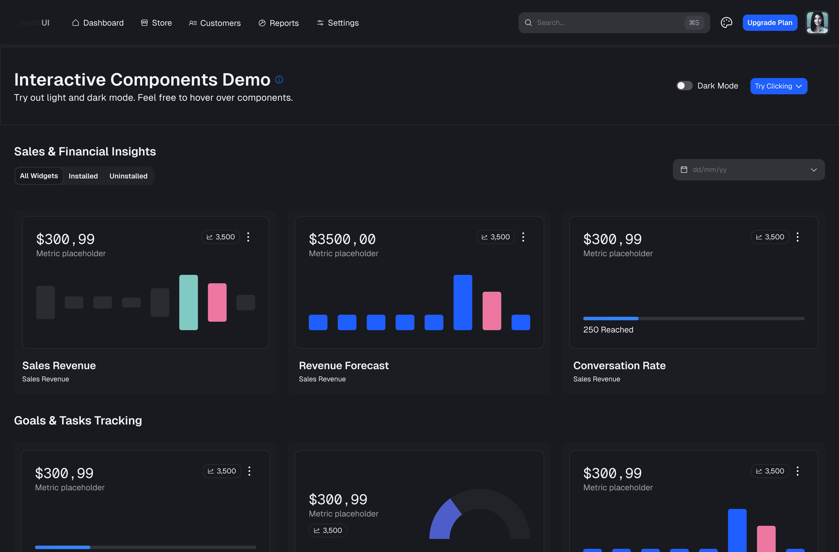
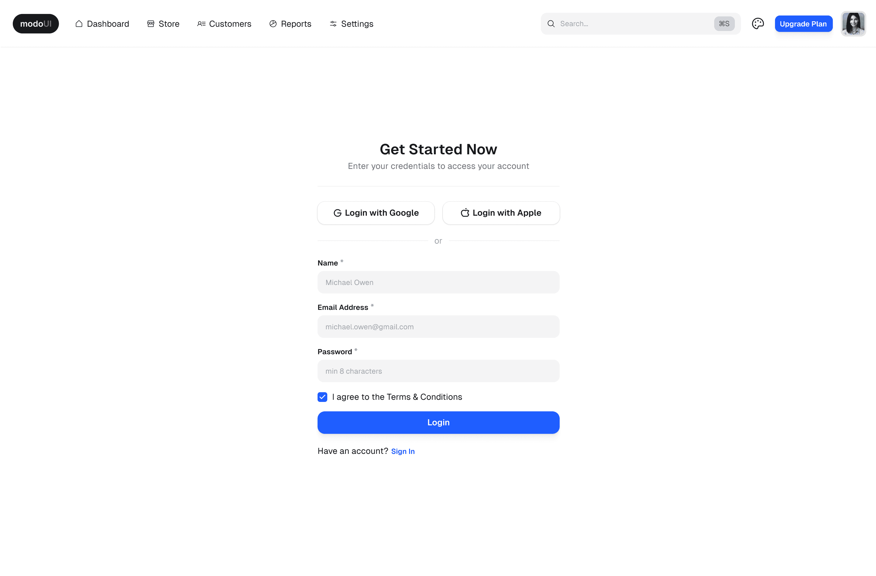
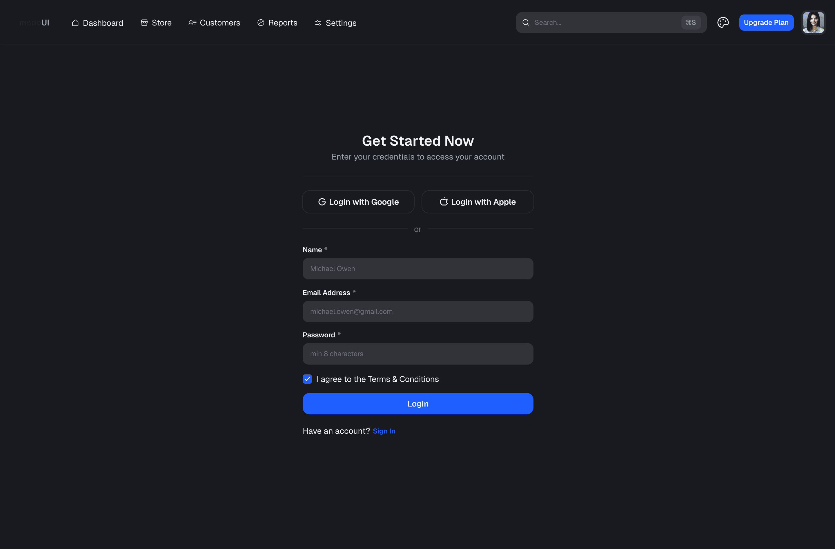
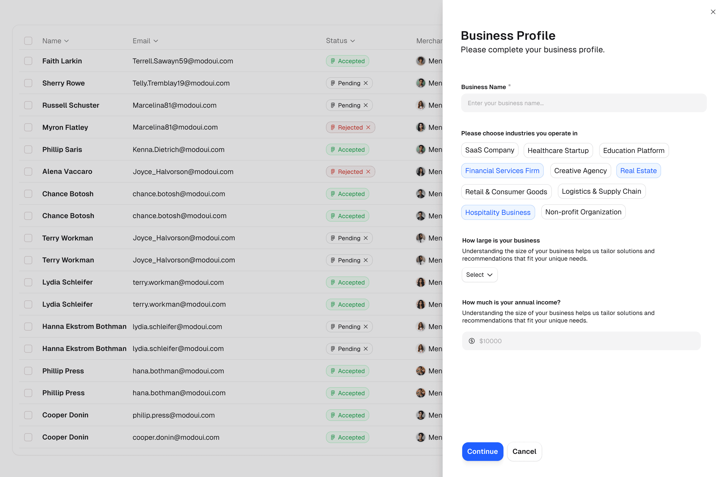
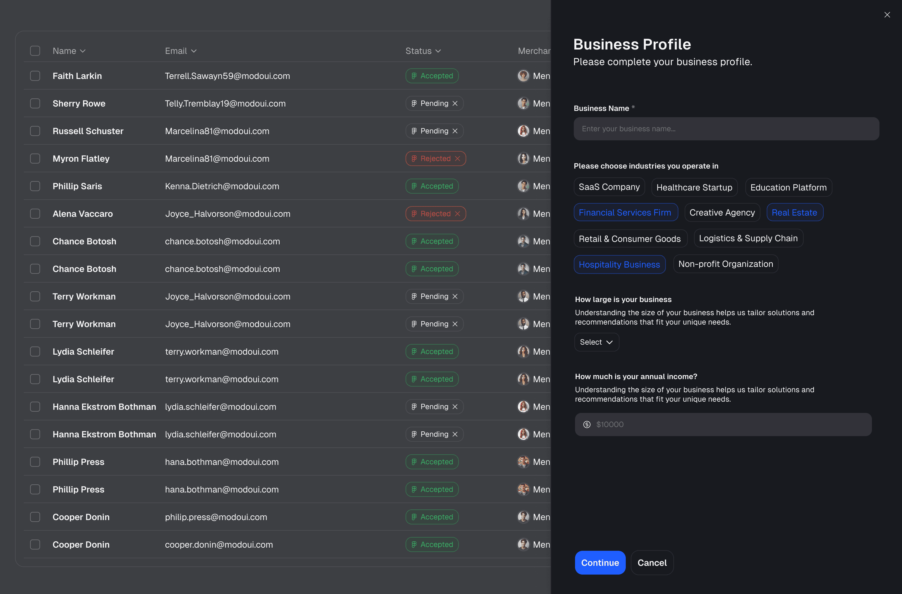
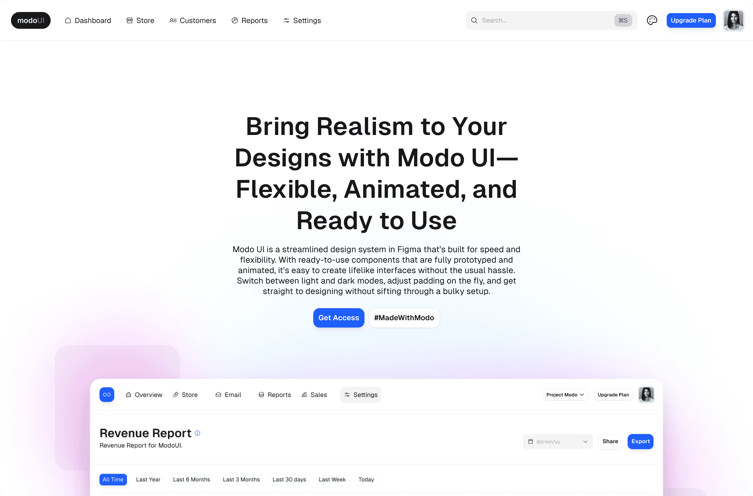
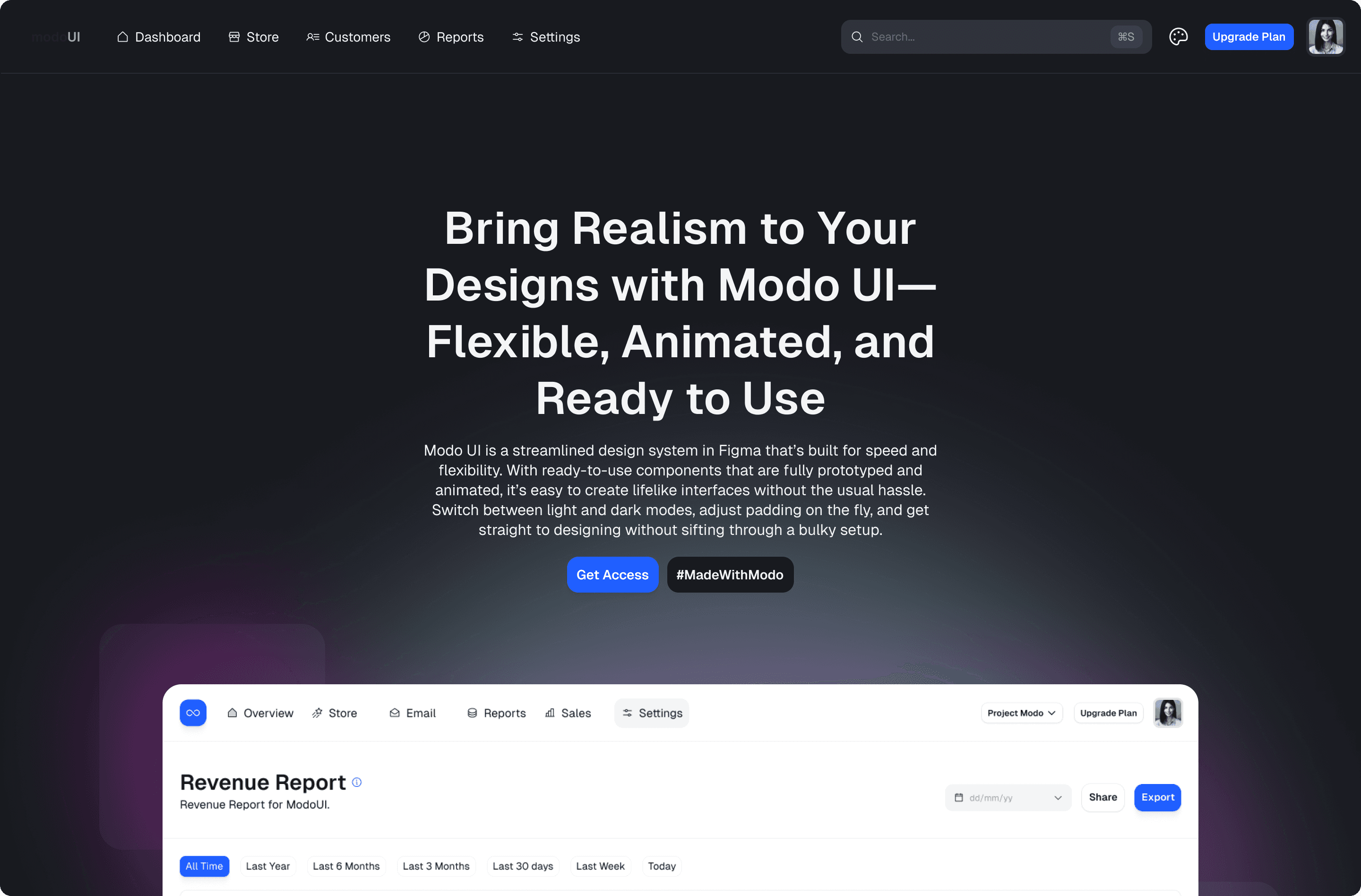
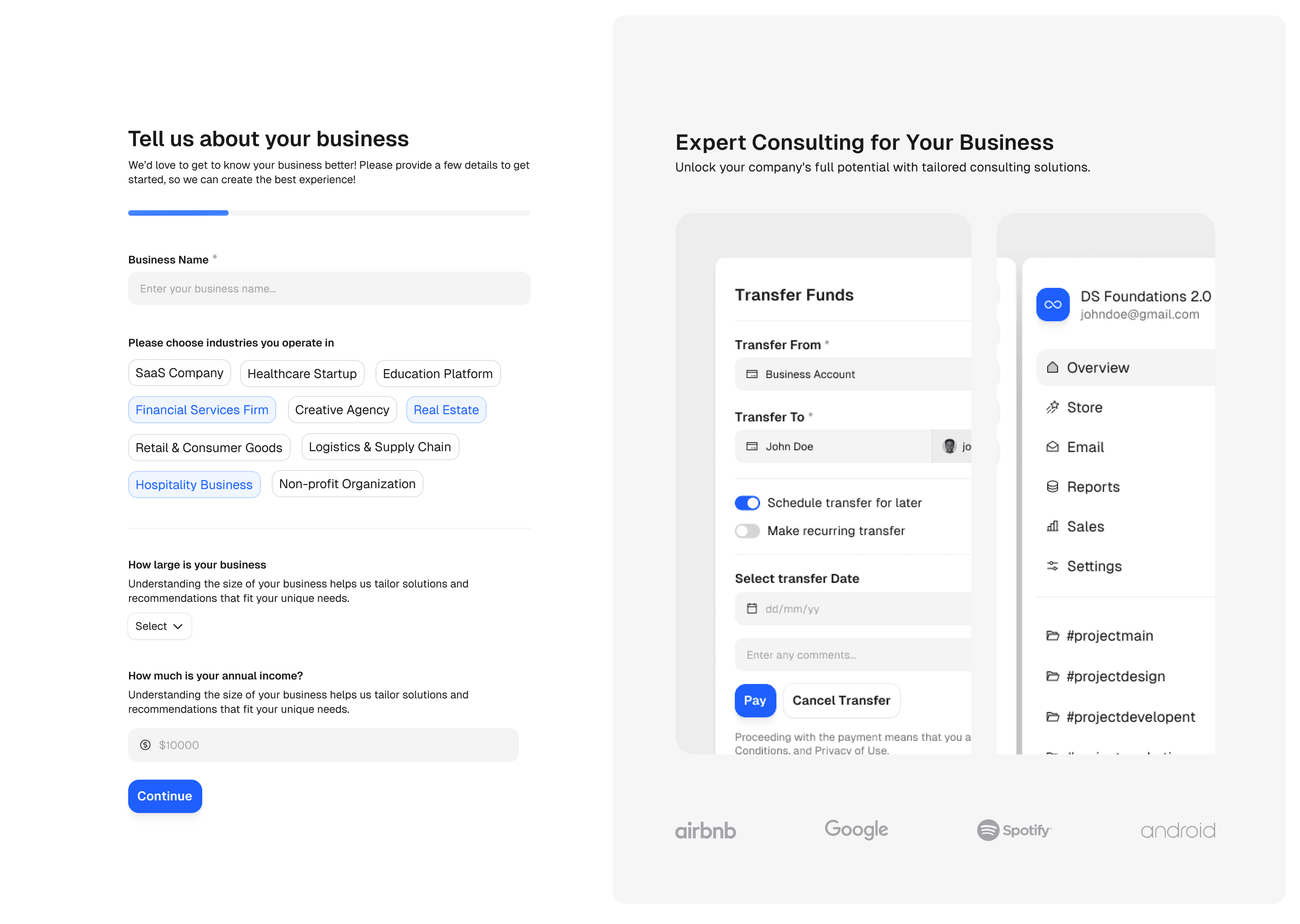
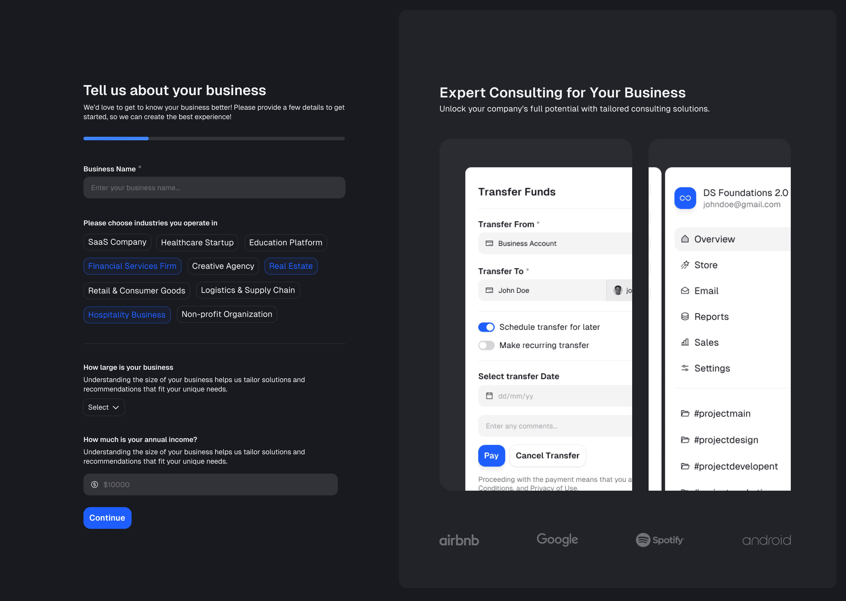
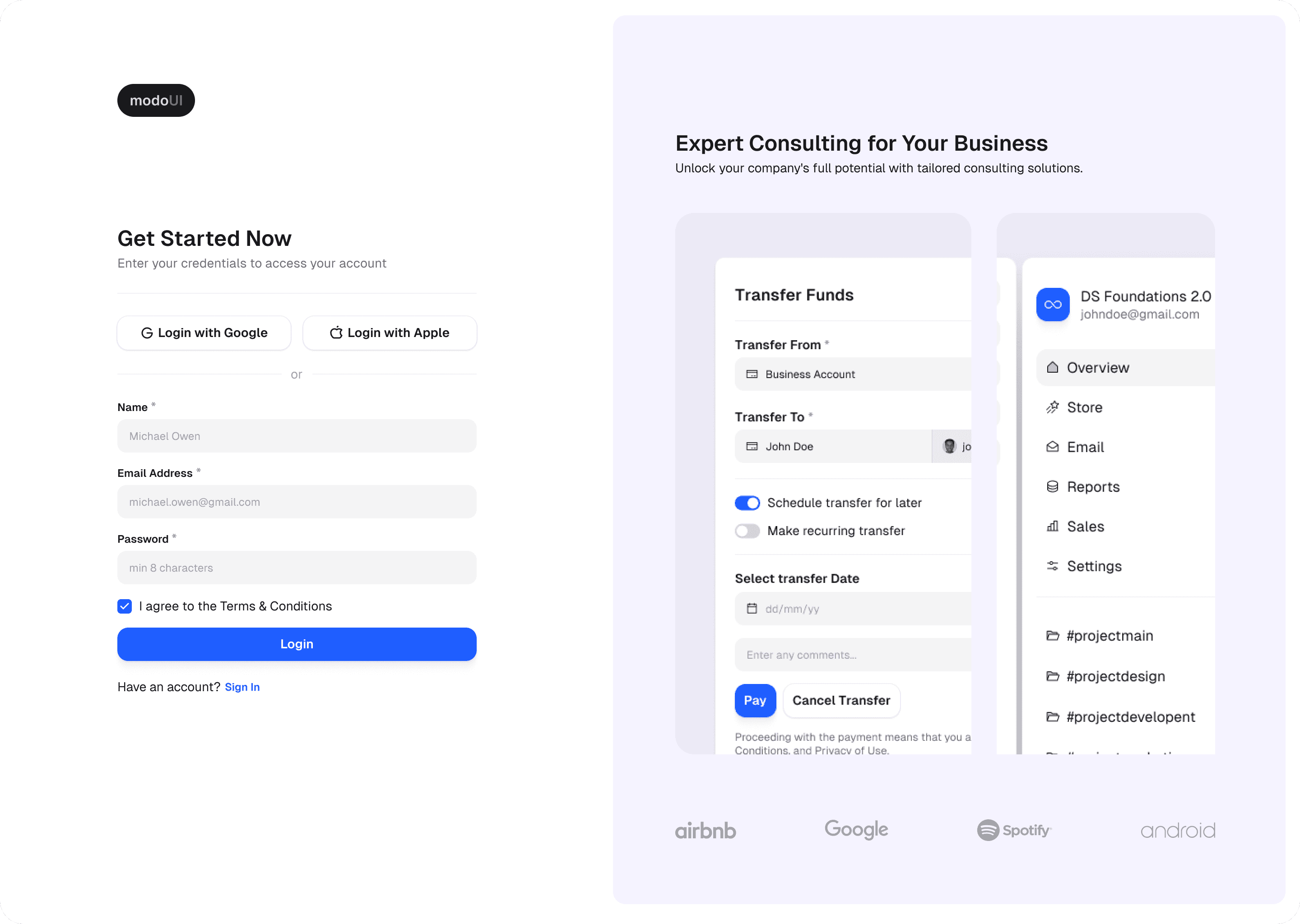
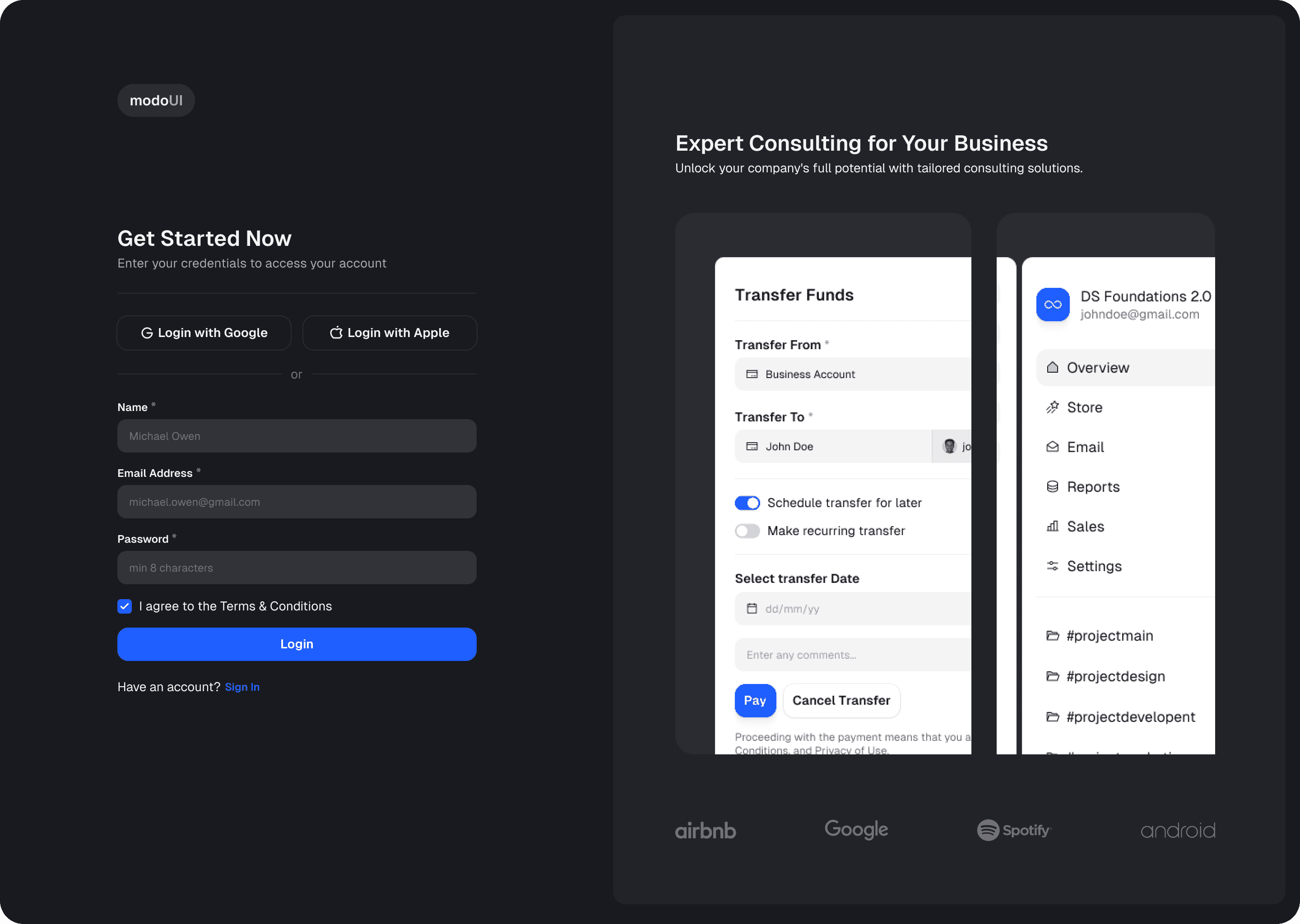
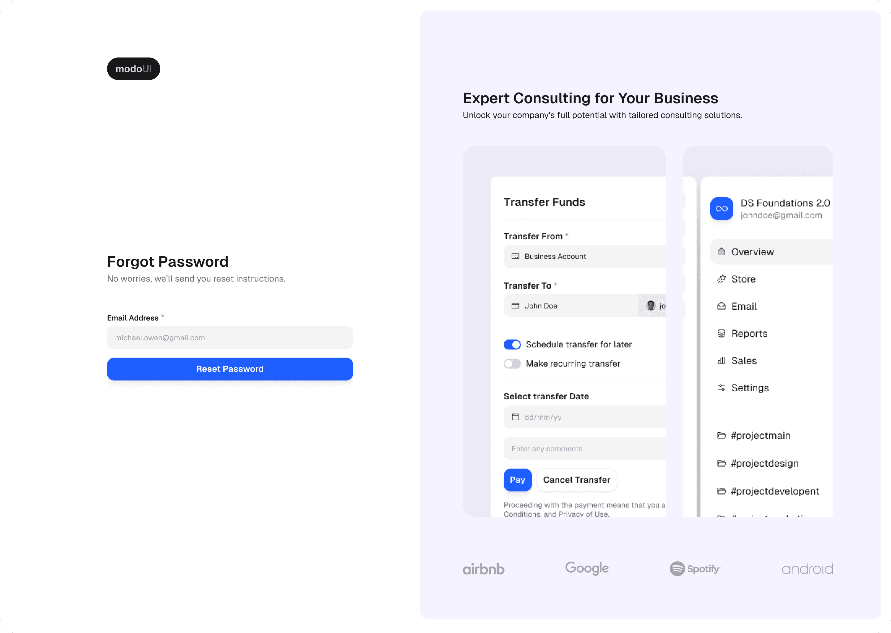
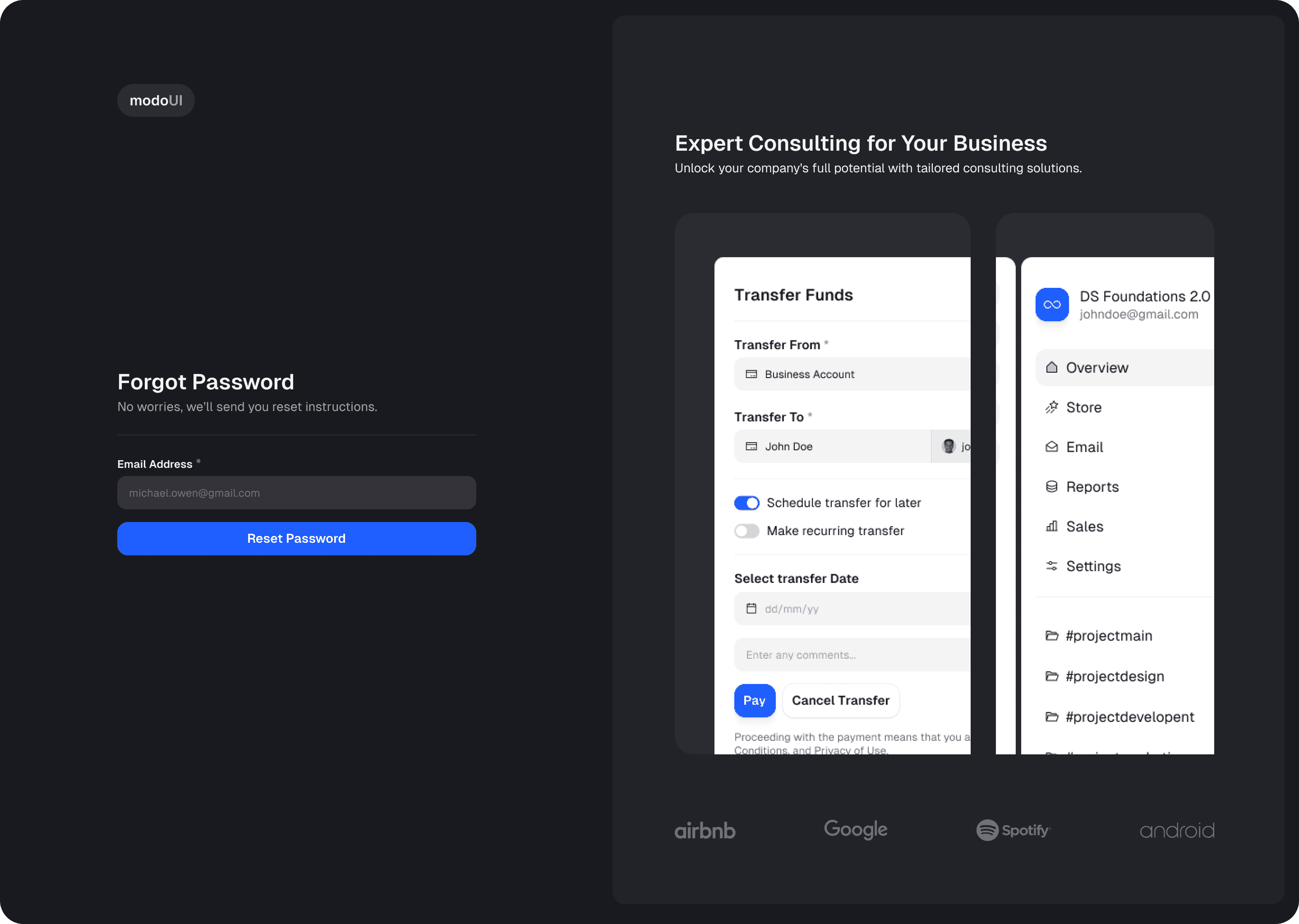
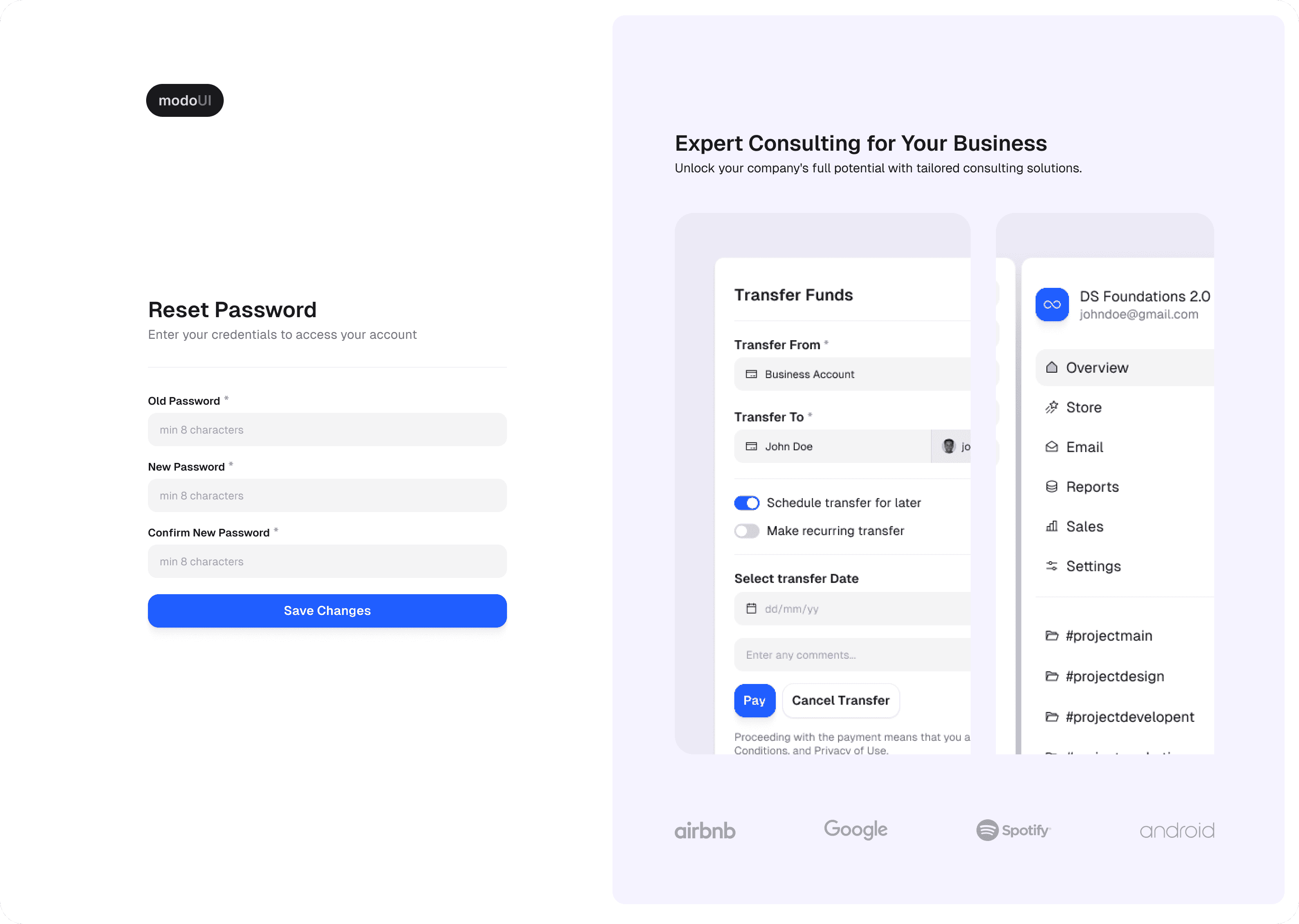
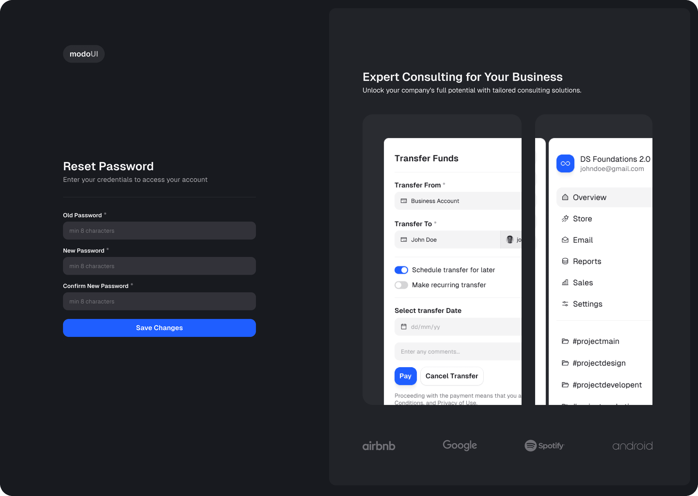
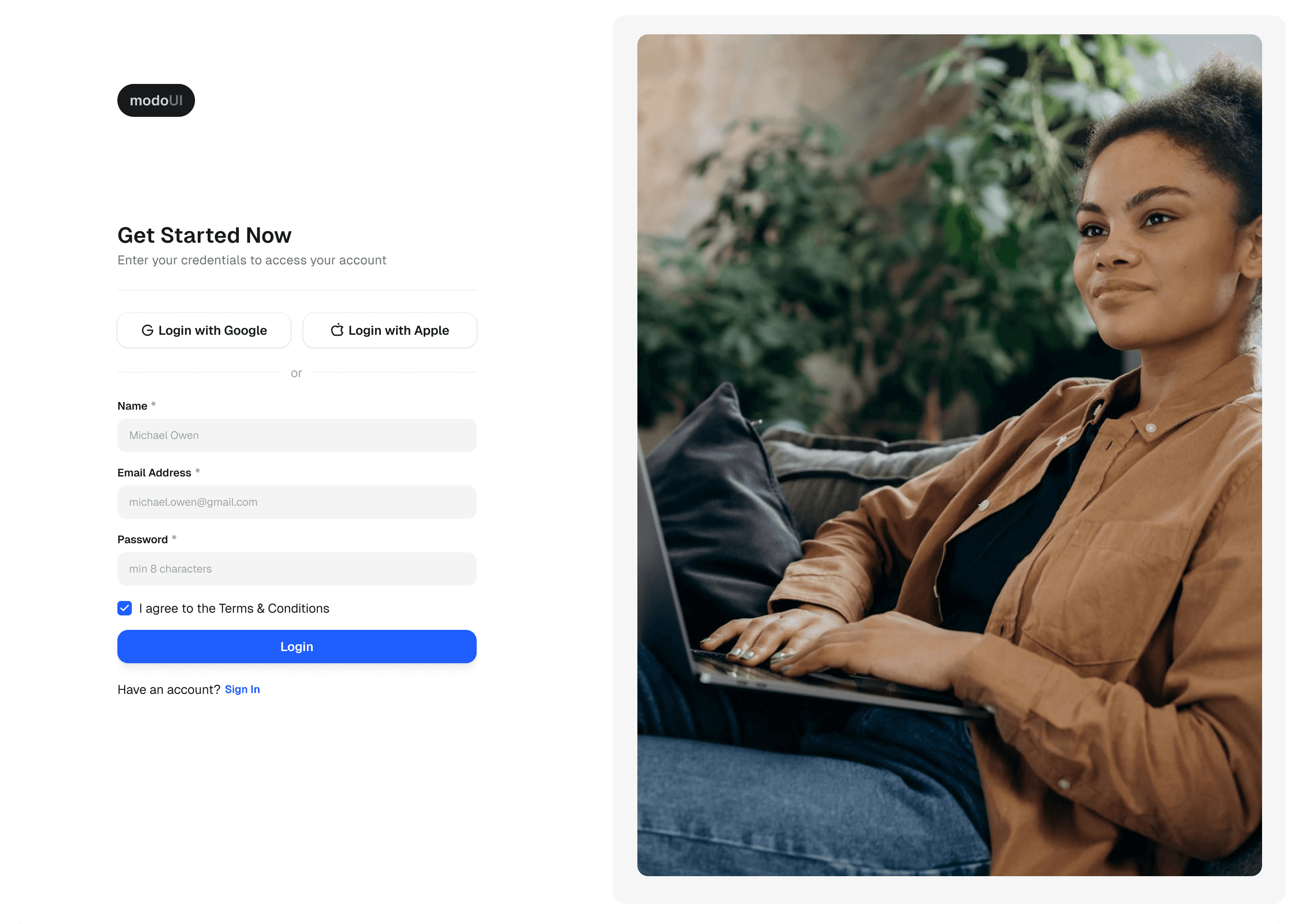
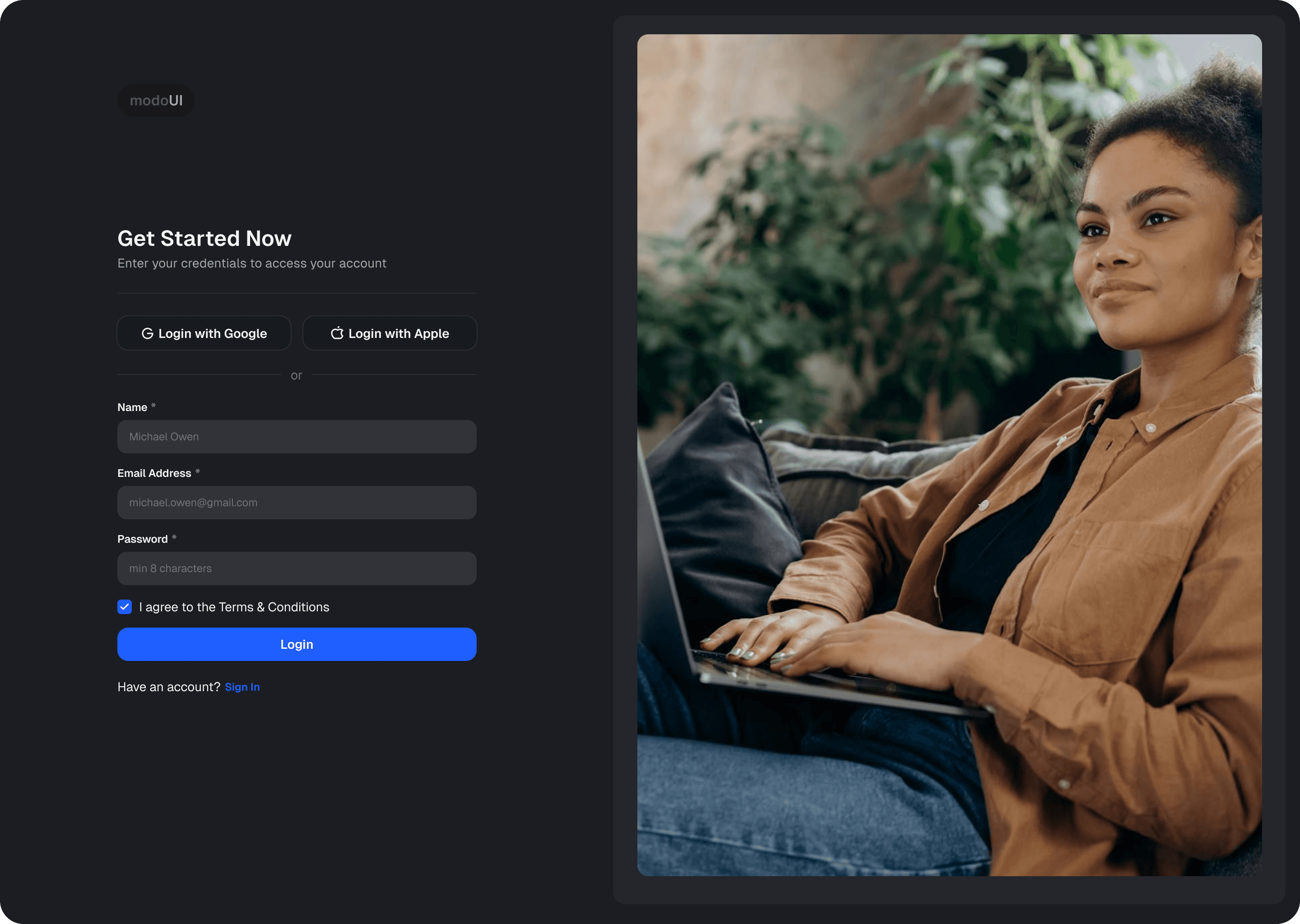
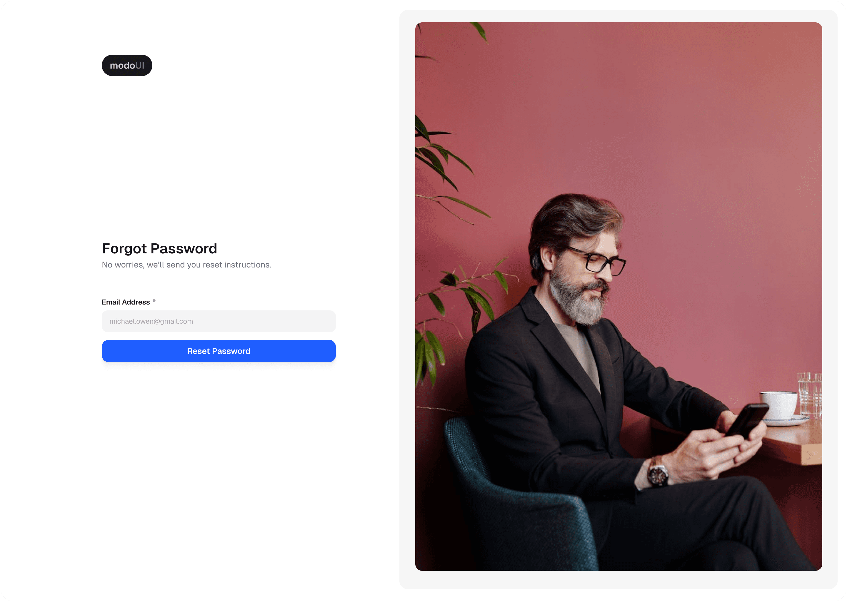
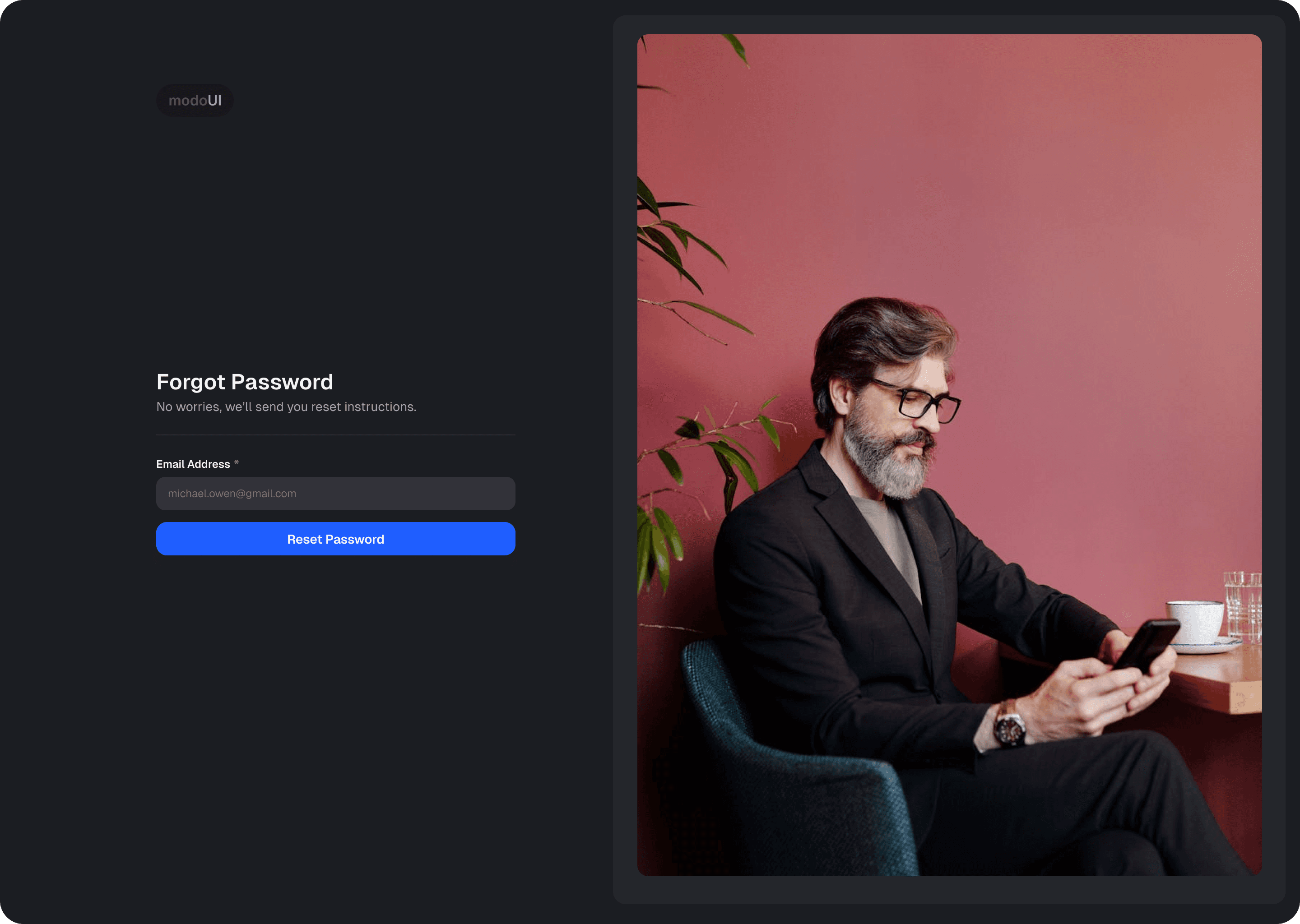
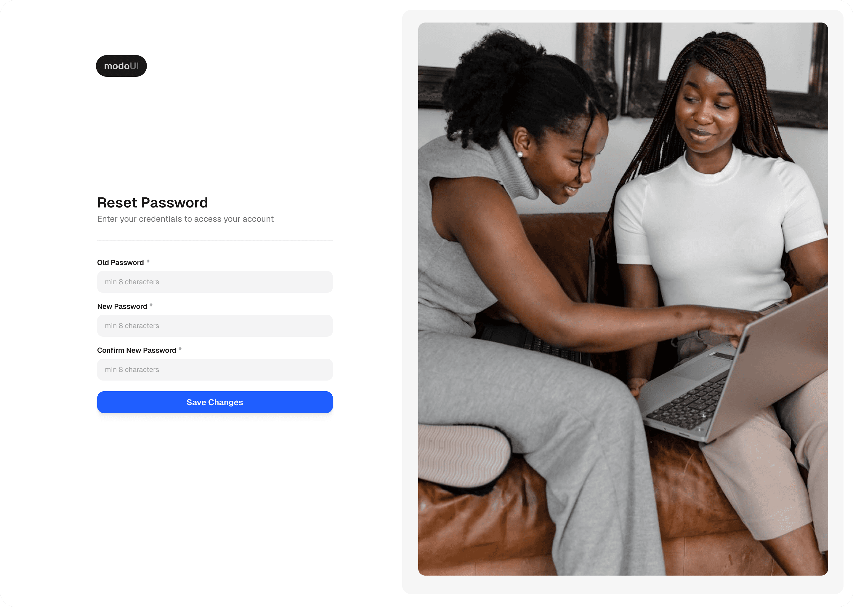
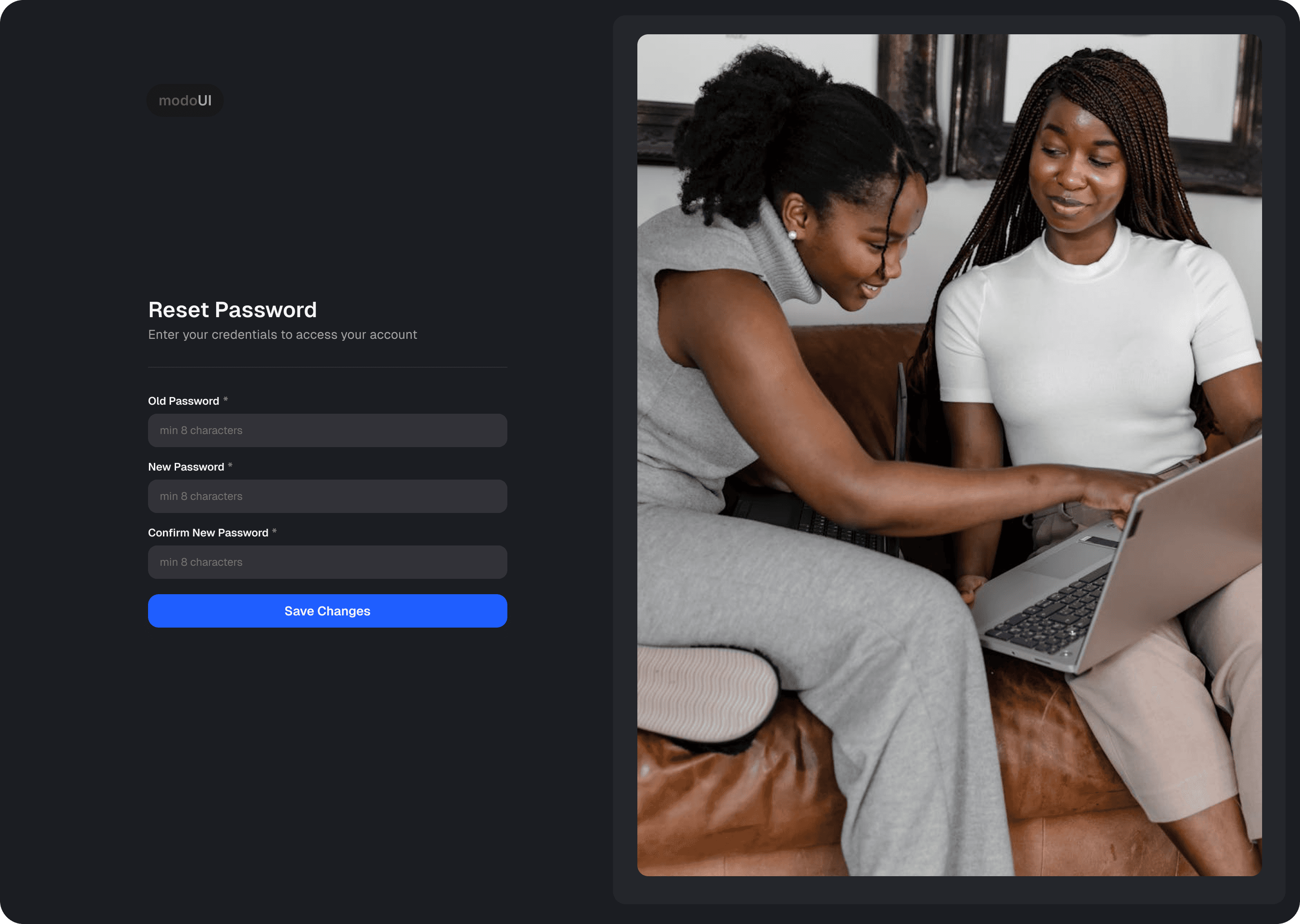
Light & Dark Theme Support
Seamlessly switch between light and dark themes to match any project’s style. Adapt your designs instantly for different user preferences.
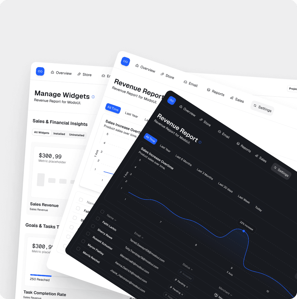
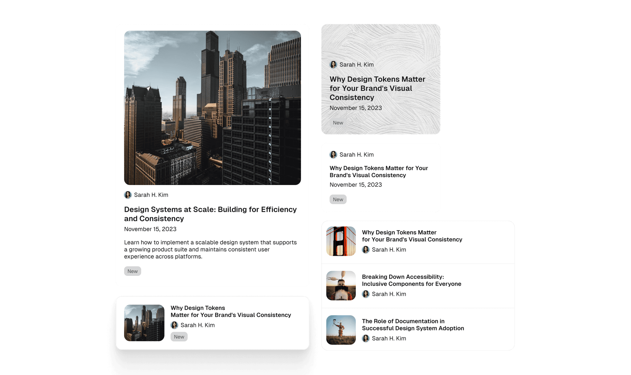
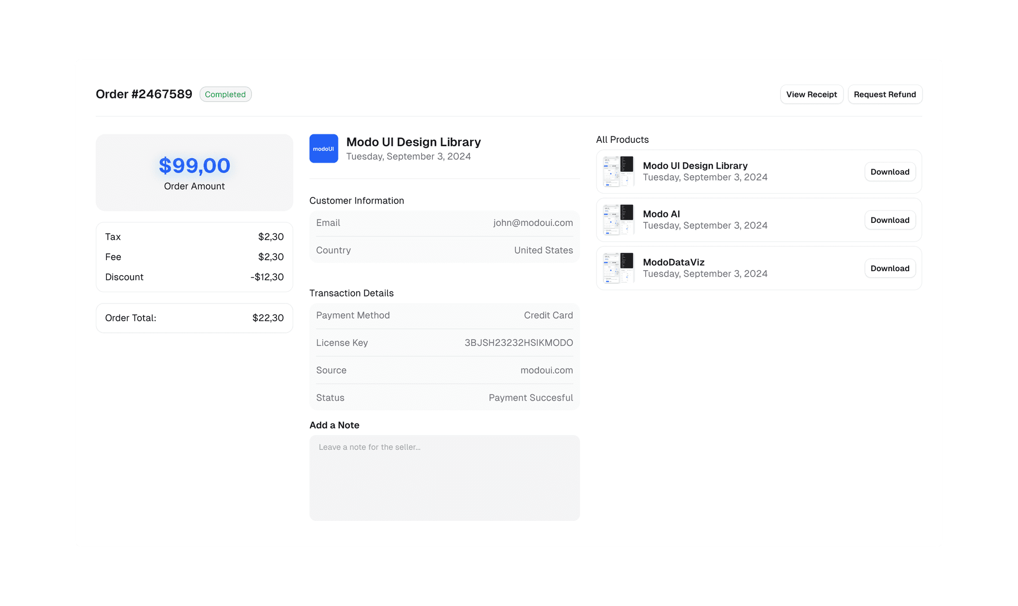
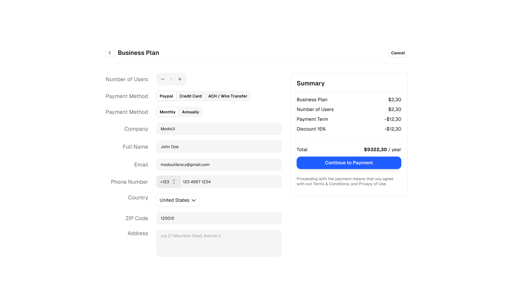
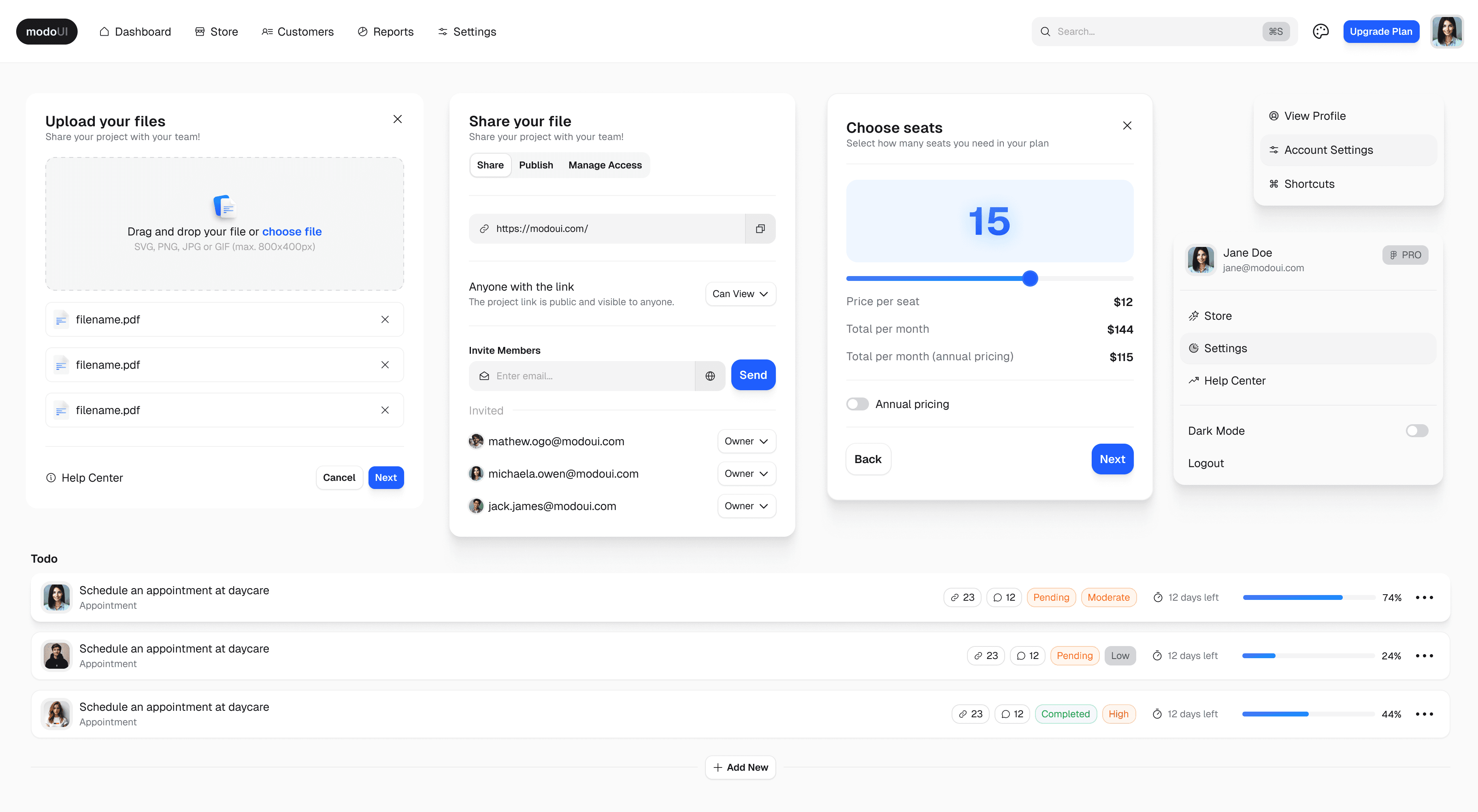
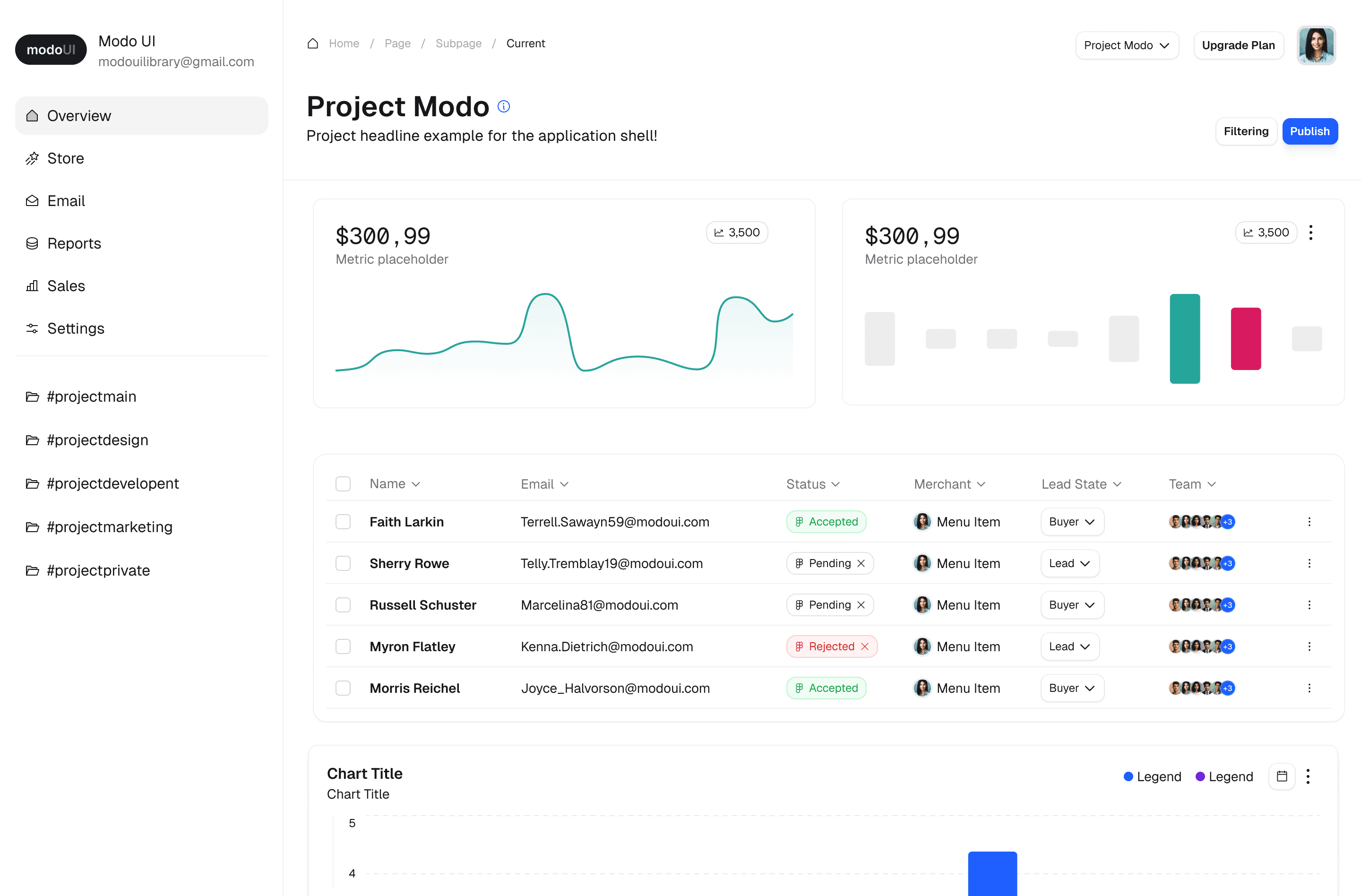
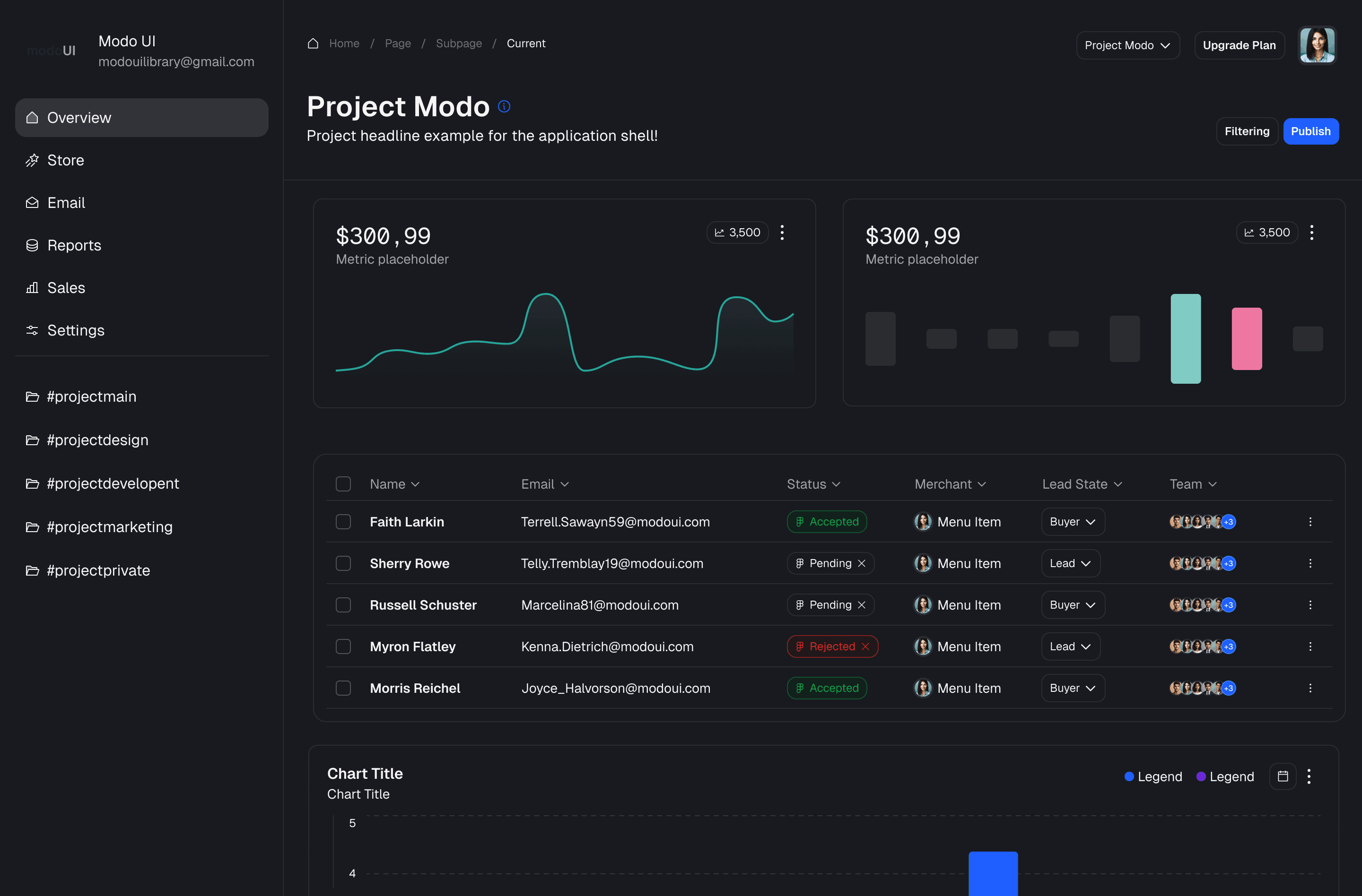
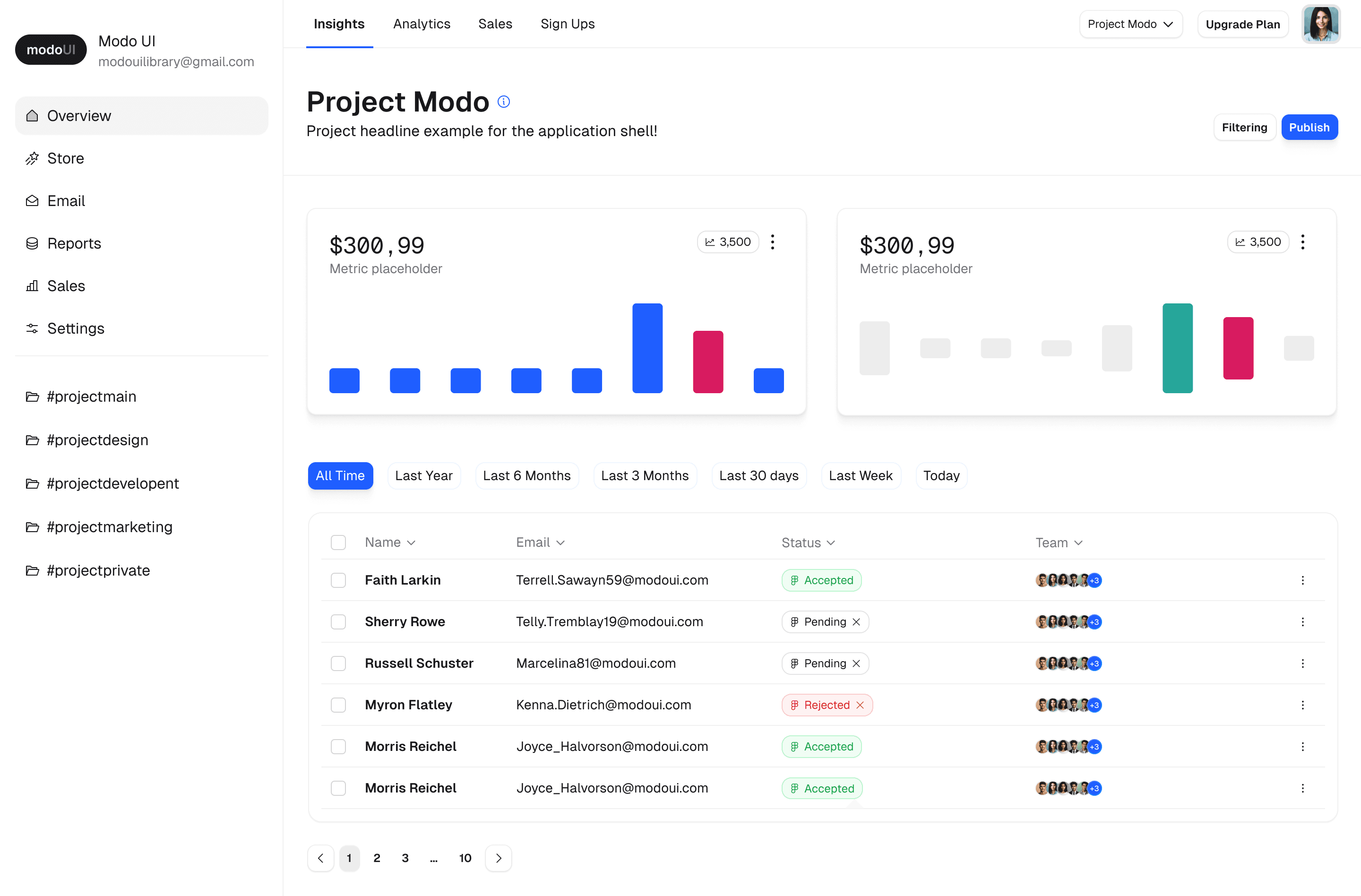
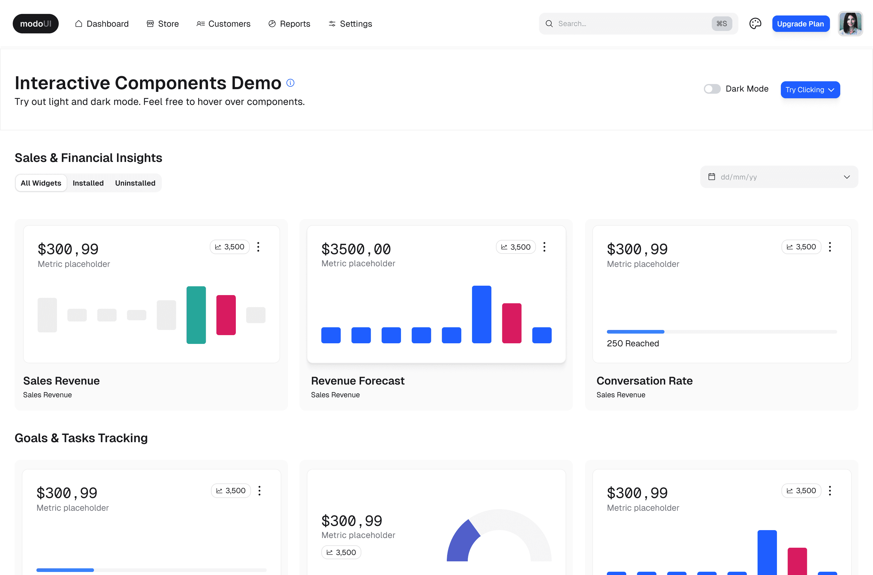
Lacking Ideas?Jumpstart Your Projects with Ready-Made Screen Templates
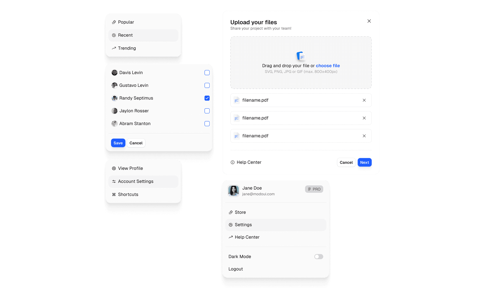

Devs will love you! Seamless handoff with human-readable variable names!
Modo UI addresses the core challenges in design: crafting flexible, high-quality prototypes without hours of setup. Effortlessly toggle between light and dark themes, switch between compact and full-size components, and create realistic, interactive elements right from the start.
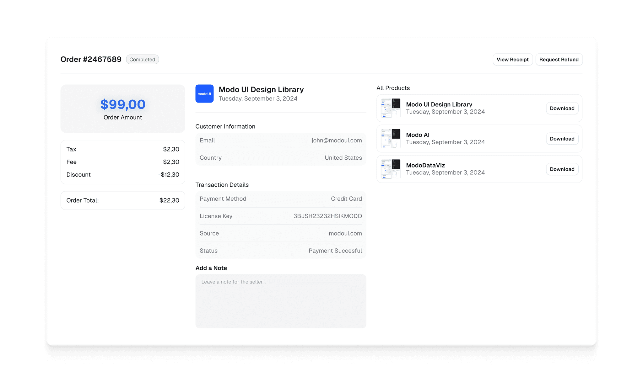
Kickstart your Projects with Application Shells & Pre-made Screens!
Start designing with fully-structured templates, ready to adapt to any project. Switch between dark and light modes effortlessly and customize with powerful, easy-to-use color variables.
One-Time Investment for Lifetime Access & Updates.
Unlock rapid prototyping with Modo UI's pre-animated components. Effortlessly switch between light and dark modes, customize padding instantly, and design without the clutter.